Catherine Twomey’s artwork depicts who she is at the moment, and the fact of the matter is her interests are ever changing. So, it makes sense that her artwork spans from still life to landscapes to animal portraits—and then some!
For Catherine, an emotional connection is key. She looks to the greats, like Georgia O’Keefe, da Vinci, Rembrandt and Degas, pinpointing their struggles and triumphs and honing in on their unflinching persistence. And, her own tenacity for her craft has paid off. Catherine’s work has been featured at a world renowned TED (Technology, Education and Design) conference, and is even housed in two museums—the William H. Benton Museum in Connecticut and the LLoyd Museum in Cincinnati, Ohio.
The high drama in this first painting, Apple Meets Crock, cannot be contained. A matte black background absorbs any trace of light, allowing the oddly suitable pairing of rustic stoneware pitcher and shiny red apple take center stage.
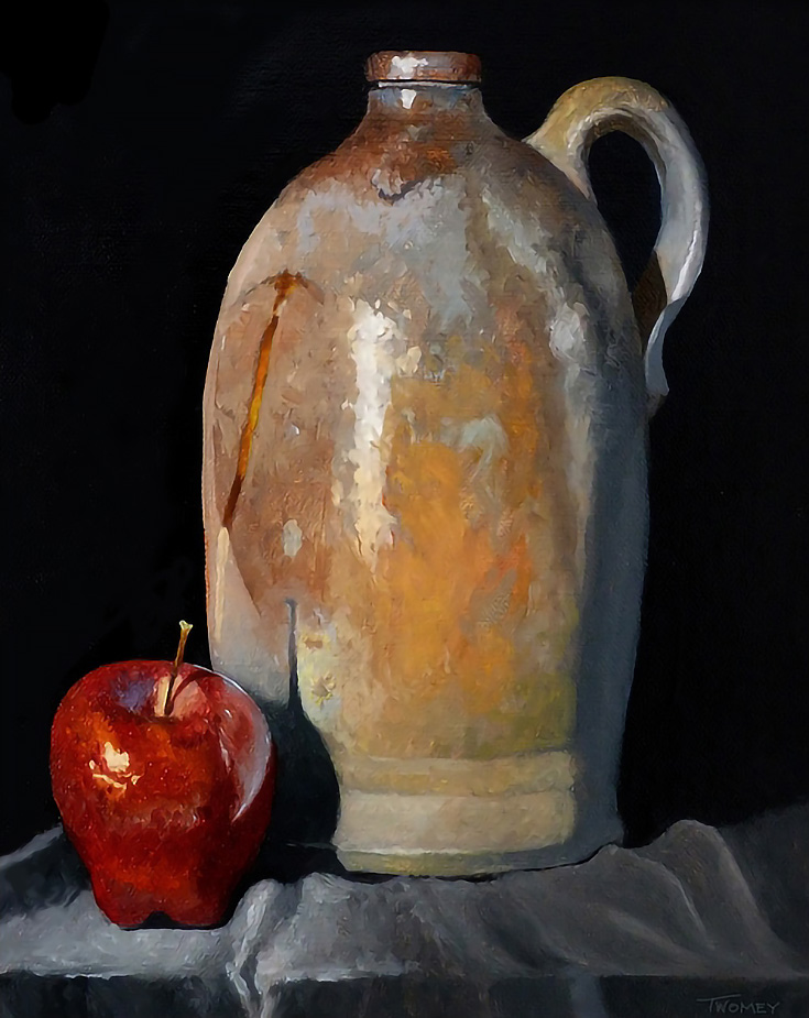
A steel gray tablecloth echoes the natural color of the pitcher before age and heavy use tinted it an antique bronze, while the apple looks as though you could pluck it from the oil painting, so detailed is it with its slight dimples, dents and speckles of color atop its waxy peel.
Switching gears, we turn to the watercolor below, entitled Aspen Landscape. The colors are lilting and moody, perfect for the mountains which are capable of fluctuating in scenery with the slightest change in weather.
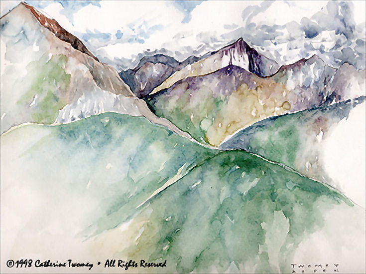
Snowfall and heavy clouds drape the mountains in a thick blanket of white, yet we can see the beauty even in the shadows, which fade from evergreen to violet with the drifting snow.
These massive peaks, usually so unattainable, are brought practically to our front door with this clever composition, featuring a sloping mountain in the forefront that vanishes just inches from us. It makes you feel like you’re a part of the very scene, with the chill wind blowing in your face.
Lastly, there’s something incredibly easygoing and delightful about Advance Mills Hay Bales No. 1, with it’s bright, carefree colors and the relaxed way Catherine paints the gently rolling hillside.
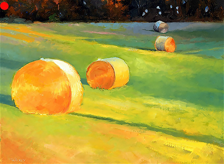
As the colors switch from golden to green, so does light turn to shadow until the tree line in the background almost disappears. Bales of hay seem to always have a hazy sheen around them, and I love that Catherine depicts this in the painting, while cleverly hinting at the hundreds of layers wrapped within the heavy bale. This is expressionism at its best!
Make sure to click through and view the rest of Catherine’s impressionistic artwork on her website—you won’t be disappointed!
This post may contain affiliate links.