I’ve already written a few articles about color here at EmptyEasel, including one on how to mix paint colors, and another on the amazing power of color in paintings.
Today I’ll be writing about how to SEE colors better, by looking specifically at three qualities every color has:
Value, Intensity, and Temperature.
Anybody can look at the ocean and say that it’s blue. But when asked to describe that blue, or the exact green of a pine tree, what would you say? If you’re an artist, of course, you might explain that the tree is a kind of brownish/green, or that the ocean on a cloudy day is more gray than blue.
Even then, it’s hard to narrow down colors exactly – and most of us aren’t naturally gifted that way either. But whether you’re gifted or not, by analyzing and learning to describe color, ANYONE can become a better painter.
Let’s start with value first. This strip of red has a full range of it.
It goes from a light value on the left, to a dark value on the right. Most of us train our eyes to see value by drawing with pencil or charcoal. That’s great practice for painting as well.
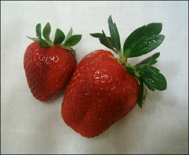
In the following image, it’s obvious that the strawberries have quite a few values of red.
If I was painting them, I’d put down one brushstroke of color first, just to get some red down on the canvas. Then I’d look at the strawberry again and judge whether the next brushstroke (say, to the left of the one I already painted) should be a bit darker or a bit lighter.
Sometimes I think of painting as a constant adjustment of color. If you don’t get the value right the first time, that’s OK. By just having some paint down on your canvas in the first place you can compare it with what you see in real life (or your reference photo) and adjust it as necessary.
Intensity of color is the second quality to watch for. You can think of intensity as the overall purity or vividness of color. A muted, neutral color like a gray always has low intensity, while a bright orange has high intensity.

As a general rule, objects that are farther away tend to be more neutral than objects close up.
That plays a subtle part even in these strawberries – the most vivid red is the closest red to us, on the bulge of the large strawberry.
After intensity, the third quality I look for when painting is temperature. And of course, that has to do with how cold or warm-looking a color is. Most colors tend to be one or the other: blue is cold and red is warm. But within the hues themselves there can be levels of coolness or warmth, and those are very important to be able to see when painting.
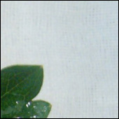
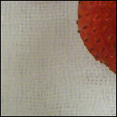
For instance, take another look at the cloth those strawberries are resting on. What color is it? How would you paint it?
Well, it’s really a white cloth, but because of the way white reflects light it has very obvious cold and warm areas. In the upper right, it’s a cold, vivid, light blue, and in the bottom left it turns into a neutral tan.
If I was painting this I’d start by mixing up some of that vivid blue, and then as I moved down and towards the left I’d neutralize, warm up, and very slightly darken my mixture of paint.
The temperature of an object is often in relation to how much light it’s receiving, and what kind of light it is (outside light, studio lights, etc.) Our eyes accept temperature shifts without thinking about them, but as artists we need to understand that they’re always there, and paint them in.
So in review, when painting, ask yourself these three questions:
1. Is the color I’m trying to match darker or lighter than the color I’ve mixed?
2. Is it more neutral, or more vivid than my color?
3. Is it colder or warmer?
If you keep those thoughts at the front of your mind while painting and adjust your paint mixture accordingly, the correct colors will soon follow.
This post may contain affiliate links.


