Who needs a paintbrush to paint? Not John Monson! John received his Bachelor of Fine Arts in studio art from Western Washington University, and is inspired by abstract expressionists. He uses various tools to layer oil paint on canvas, resulting in dynamic tension between rough texture and smoothly blended paint.
“My process yields a great variety of form, texture and color relationships that energize the surface while simultaneously generating pictorial depth and a sense of movement and time,” he said.
Let’s explore the first painting below. Although most of John’s work is very abstract, with this painting, one can easily envision the reflection of puffy clouds making their way lazily across the lake near sunset.
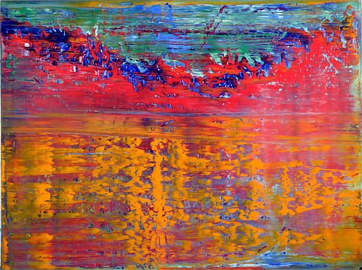
Jagged mountains half-bathed in shadow and half-ignited by the fiery hue of a burning sun appear just past the lake. Farther past the mountains, blue and green shadows consume a sky, which succumbs to dusk.
What I love most about this painting are the bold color choices. John went all out, using warm reds, oranges and yellows and then complementing them with cool greens and blue undertones. As a result, the mountains are elevated and each ridge is defined, while the water takes on a colorful complexity.
John moves from bold to subdued in this next painting, but the results are equally exciting. At a glance, the dark shapes splotched here and there resemble hundreds of birds, near and far, taking flight. . . in a way, they echo the pastels in this painting, which also sweep across the canvas in broad horizontal stripes.
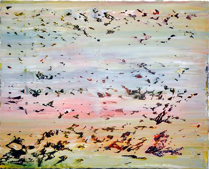
The dark accents in this piece are accompanied by brighter shades of the pastels we see in the background. Rich reds, greens, oranges and yellows take up residence near the inky black/purple shapes, bathing them in interesting dimensions and angles. And of course, texturally, the painting is fascinating—from afar, it almost looks like the canvas has been rubbed with some sort abrasive to create tears and rips that in turn, create those darkened, shadowed layers.
This last oil painting has an altogether different look from the first two paintings we’ve explored. Its texture isn’t rough or heavy, but glossy. The reflective quality of the blue/gray background propels the bright, primary colors forward, and it almost appears as if there is distance, or space, between the two.
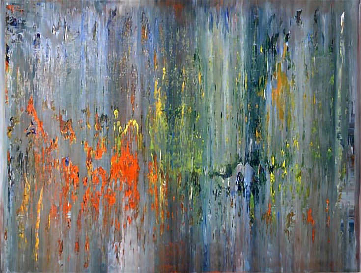
At the same time, the blurry colors found in the background seem to gradually be coming forward, as if they are being squeezed out of the background and are bleeding into the foreground. It’s a pretty cool visual to be left with, don’t you think?
To view more of John’s great artwork (and you know you want to), you’ll just have to visit his website. Head on over and take a look right now!
This post may contain affiliate links.