As many of you know, earlier this year I launched a new website builder offering easy artist websites for painters, photographers, sculptors, and more. Here’s a quick update on the new customization features we just added yesterday:
When we started Foliotwist last spring, it was quickly apparent that we were still missing an important piece of the puzzle. Nearly everyone we talked to would say something similar to this:
“Guys, it looks great—but can I customize it? You know, change colors, fonts, that kind of thing?”
“Unfortunately, no,” we always replied. “Not yet anyway.”
It’s not even like we forgot about customization. . . it’s just that when we built the first version of Foliotwist, we did it with two things in mind: ease-of-use and effectiveness. Individual customization was a very low priority at the time.
Still, for the past three months we’ve really wanted to say “yes” instead of “no”. . . and today, finally, we can actually do that. :)
Here’s what you can now customize, with Foliotwist:
Like any other website, Foliotwist artist websites are made up of several parts—a background color, a foreground color, various borders and divider lines, text and headers, etc.
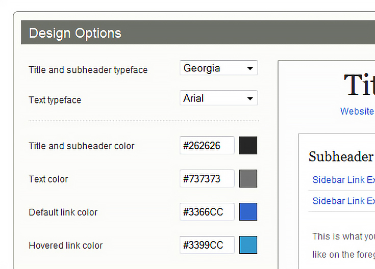
What we’ve done in this latest upgrade is give Foliotwist artists control over all the colors used in any of those elements. Here’s a shot of the new design section inside each artist’s admin panel:
Notice the preview area off to the right, showing “Title” and “Subheader” (among other things). Everything in that section changes immediately as you update a color so you can see how your website will look before saving your selections.
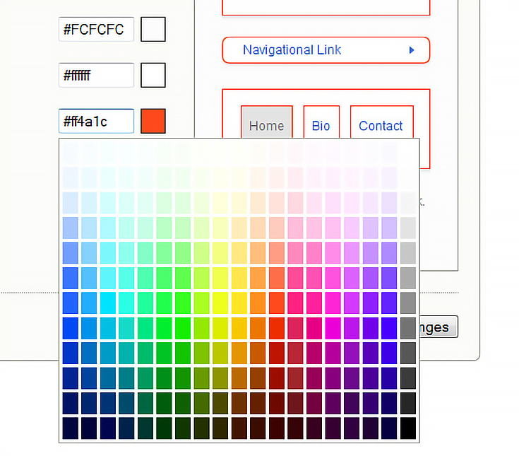
Just click a swatch to open up the color palette, then go to town.
With over 228 colors to choose from, you can really light things up like a Christmas tree if you want to. :)
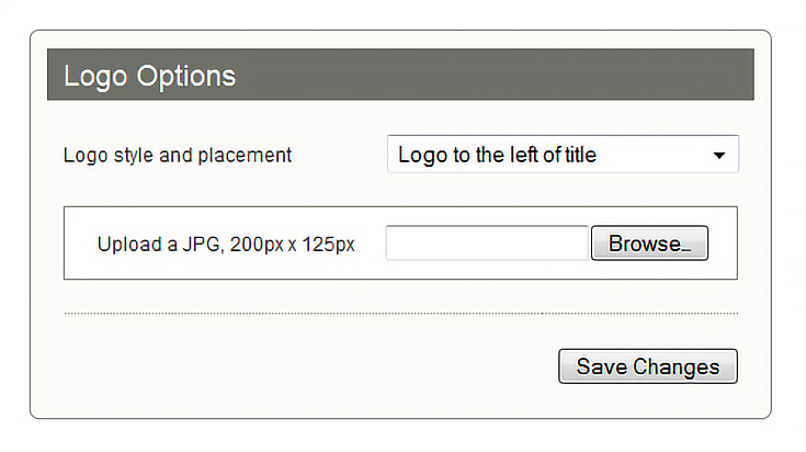
We’ve also added 8 typefaces which can be used for either the header text or body text, and included 4 different ways to display a logo. Options for logos include left or right of the title, centered, or as a banner with a border around it.
All things considered, I can’t even begin to imagine how many different color combinations are available now.
So how about a few screenshots?
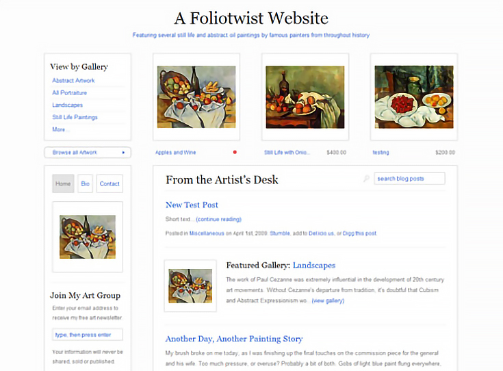
This morning I played around with our new customization options to give you a little preview of what’s possible. Here’s the original design (which I still really like—it’s very clean and minimal.)
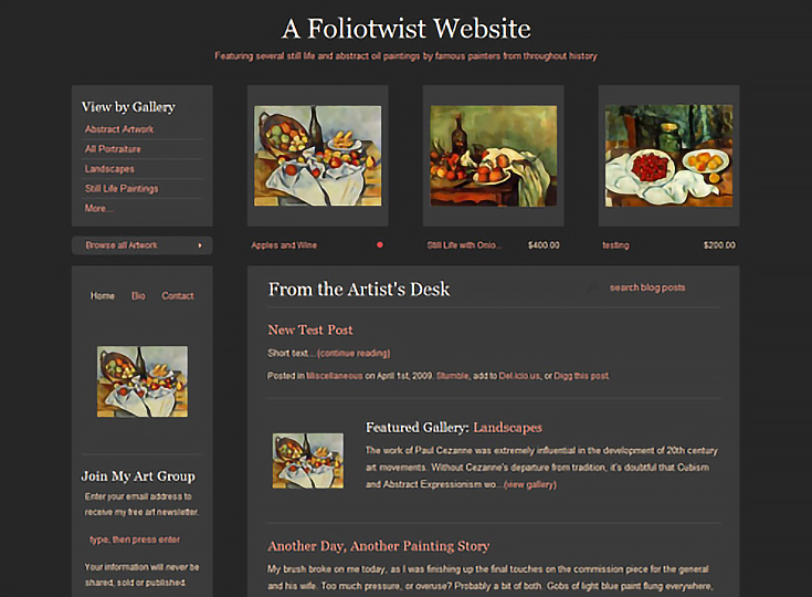
But let’s say you wanted something with a little more weight to it. . . something a bit richer, darker. This charcoal and gray layout (with peach-colored accents to match the artwork) might be just the thing.
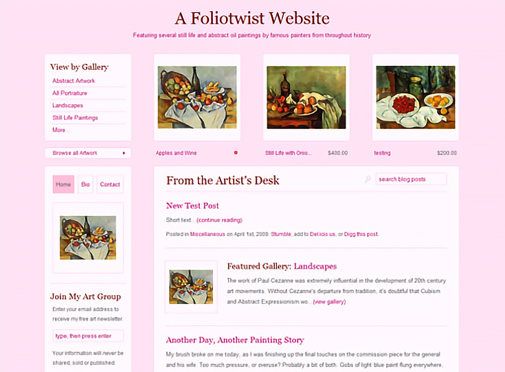
And as you saw earlier, just about any color is available. Blues and greens, reds, yellows and pinks. . . they’re all there, which means you can come up with just about any theme or color palette you want.
Overall we’re really happy with the amount of options we managed to include in this update. It’s our biggest feature release to-date (it took us just about the entire month of June to finish it) but I think the time spent was well-worth it.
As always, if you have any questions or comments about Foliotwist in general, or this update in particular, feel free to contact me directly.
Take care, and enjoy your 4th of July weekend!
This post may contain affiliate links.
