Today’s featured artist is Jennifer McChristian, a Californian oil painter who paints primarily en plein air, or from outdoor sketches finished later in her studio.
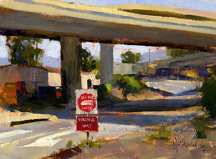
After looking through Jennifer’s plein air painting blog, her work was so consistently gorgeous that I just had to share a few of my favorites with you. You’ll notice right off the bat that most of her work features a quick and loose, gutsy textural style—as seen in this painting, Do Not Enter – Wrong Way.

Scratchy, rough, quick, textured. . . yes. But like the early Impressionists, Jennifer’s “daubs” are an instinctive reaction to her environment, honed from years of practice— and in the painting above, this adds interest and intensity to an otherwise empty curving road and overpass.
Paintings like this always make me wonder: how often have I ignored those out-of-the-way places; those empty alleys and windblown fields? What beauty am I missing in my daily commute? What am I simply taking for granted?
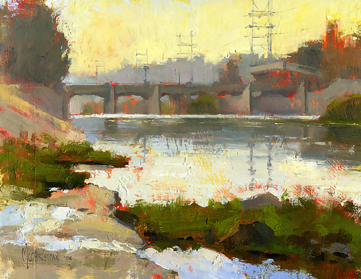
I’ve always believed that good art explores the ordinary things in life while showing how extraordinary they really are—and all of Jennifer’s paintings do that. . . often with the use of beautiful and unexpected color, like below.
You can’t help but notice the vivid orange underpainting used in the image above. By working on top of a bright, warm hue from the very beginning, Jennifer increased the final visual temperature of the painting while adding a complementary color to the cold blues and greens of the river.
SEE MORE: Impressionist landscape paintings for sale at NUMA Gallery
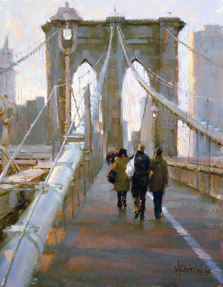
And in this next piece (entitled Making Our Way Across) Jennifer uses the same technique, albeit much more subtly, which lends a softer feel to the painting.
There’s a lot going on in this painting, but amazingly it doesn’t feel too crowded, or too heavy. The colors help with that, of course (all those light blues and yellows seen in the distance) but so does the composition.
As you can see, that large section of space in the foreground does wonders at balancing out the architectural complexity of the bridge—and Jennifer has given us a great focal point by visually framing the pedestrians inside an arch as well.
For more of Jennifer’s work, please visit JenniferMcChristian.com or check out her painting blog at jmcchristian.blogspot.com. I guarantee you won’t be disappointed.
This post may contain affiliate links.


