This week’s featured artist is Maria Serafina, a painter originally from New York who now lives and works in Italy.
All of Maria’s paintings contain beautiful textures and impeccable lighting. Most notably, by alternating her use of warm pinks and creams with cool whites, Maria gives a clear sense of both the temperature in her scenes, and the hour of the day.
Fiori di Napoli I, below, depicts an early morning scene with white walls and stone steps acting as a background to rich, orange pots and a few colorful flowers.
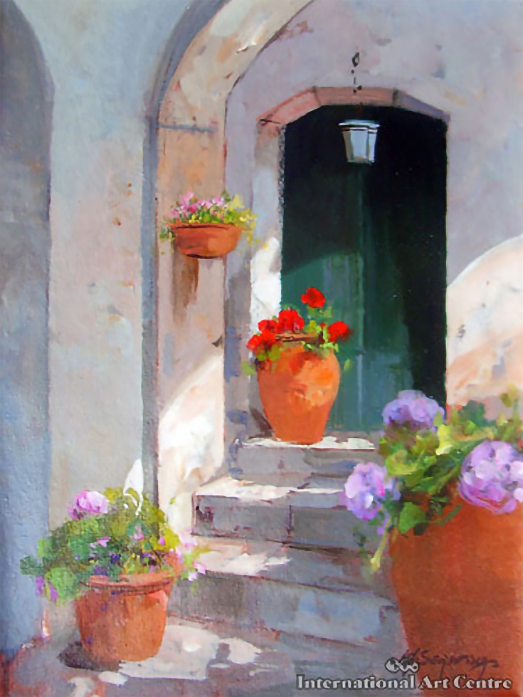
I love the composition and spacing of this painting, with larger flower pots in the foreground leading back to smaller ones closer to the door.
The architectural lines of the wall (curving downward around the door) and the angled steps help to pull viewers’ eyes deeper into the painting as well.
Villa D’Este, while also depicting lush foliage and flowers, makes its most striking statement with cast shadows on a gorgeous garden wall.
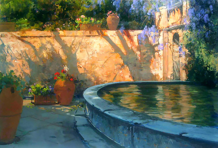
Note the warm/cold contrast between the areas lit by light and the areas in shadow. Through judicial use of “cold” oranges in the shadow areas, however, Maria has kept those shadows from appearing to recede farther back than the rest of the wall.
I also like how the nearest object (the pool) is a cold blue color, yet still appears very close, while the objects farthest away are warm. For artists who believe in the rule, “cold objects always recede,” Villa D’Este proves they don’t have to.
SEE MORE: Colorful landscape paintings for sale at NUMA Gallery
And finally, here’s my favorite painting by Maria Serafina, entitled, Tuscan Courtyard.
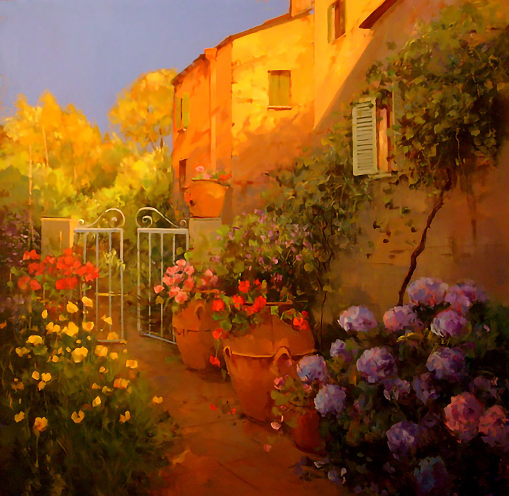
The lighting in this painting is simply phenomenal—I can truly feel the summer heat, the warm breeze, and the impending sunset. . . and the flowers are lovely as well.
If you’d like to learn more about Maria Serafina or see additional images of her work, please visit her online gallery.
This post may contain affiliate links.