Last week I came across several articles about a new social networking website for artists called MyArtInfo.com. I first read about it here, and then on several other tech websites which must have picked up the same initial press release.
My curiosity was piqued because each article I read seemed to take for granted that MyArtInfo was a groundbreaking idea. . . that a social network for artists hadn’t ever been done before. (Shows the power of a well-written press release, doesn’t it?)
In any event, I thought I’d check out MyArtInfo myself and see how it compares to other artist communities I’ve reviewed before, like MyArtPlot and RedBubble, which have both been around for a little over a year.
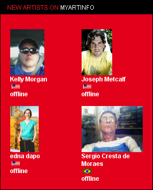
So nothing groundbreaking there, at least when it comes to social art sites.
The design itself, however, was interesting. Pretty much everything on MyArtInfo can expand into existence or minimize away, so you essentially stay on the same page the whole time. It took a while to get used to, but once I realized I could expand comments, blog posts, etc, I did enjoy it more.
Even when you click on a thumbnail image, you don’t go to a new page. Instead, a new section appears at the top of the page pushing everything else farther down, and the artwork and description show up there.
As cool as that all was, it also seemed to make the website run slower than necessary. There are a lot of images to load, of course, so that’s part of it—but I think the main reason is all the fancy code running in the background.
Navigation was easy enough, although I found out that a few of the main navigational links lead OFF of MyArtInfo.com to its partner sites. . . which seems incorrect to me.

And unfortunately there’s no real “gallery-style” display for artwork on MyArtInfo, so it’s not as easy to browse art as an art site should be.
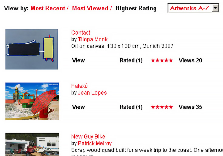
For example, if you search for “Paintings” the results are simply listed as small thumbnails in a single column, with extra information on the side.
I think several rows of thumbnails going across the screen would work better, so people could browse more art at one time (and that would probably allow for the use of bigger thumbnails too.)
Of course, then they’d have to get rid of their ad column on the right, so that probably won’t happen anytime soon.
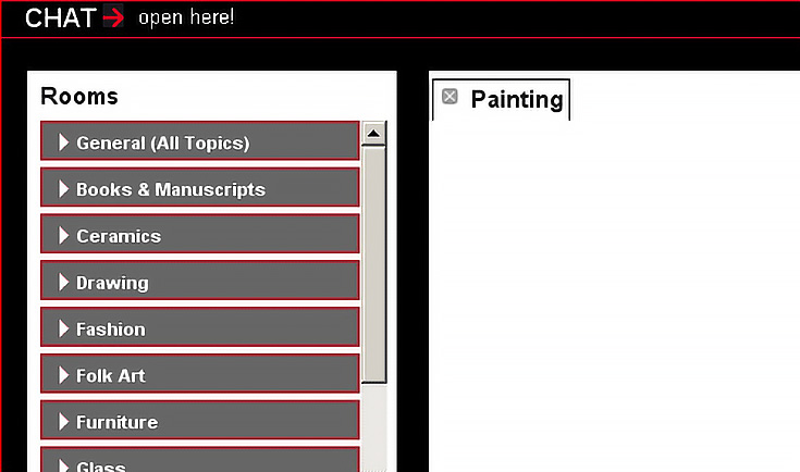
Signing up is free of course, and dead simple, so no issues there. The chat section, on the other hand, was just dead. . . or perhaps I didn’t know how to use it properly. It suppose it might pick up after the site grows a bit more.
Oh, and if you haven’t realized it already, MyArtInfo is closely related to ArtInfo.com (actually, both are owned by LTB Holding ltd, a publishing company that focuses on art) which explains why most of the ads on MyArtInfo point to ArtInfo.com or other websites owned by the parent company.
It’s obviously a smart business move for LTB Holding to try and build a social network where they can advertise for their other products, and I suppose it’s not necessarily a bad trade-off for artists, since all the ads are at least somewhat art-related.
I’d encourage you to visit MyArtInfo and take a look around to see what you think. Just keep in mind that MyArtInfo isn’t a substitute for your own art website or art blog, and I don’t really see it as a place to sell your art either—although I suppose that could happen occasionally. No, it’s definitely geared to be more of a networking, “friend-finding” website for artists.
If you want my opinion, though, I think MyArtPlot and RedBubble do the whole social networking thing a little better. Plus, they both give you ways to sell your art too.
But hey, it’s good to have a choice, isn’t it?
This post may contain affiliate links.
