This week’s featured artist is Jiddje Straatsma, a graphic designer and painter from Friesland, Holland.
Over the last few months I’ve really enjoyed Jiddje’s landscape and still life paintings, especially those that capture the unique qualities of his home province.
Painted clogs, for example, are both a great subject-matter for a small daily painting and an interesting look into traditional Dutch culture.
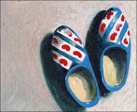
These particular wooden shoes also happen to be full of character and color, which I’m sure made them fun to paint.
Aside from the clogs, though, (and some assorted vegetables and fruits) the majority of Jiddje’s paintings showcase his country’s beautiful canal-crossed countryside.
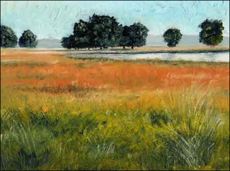
Just look at that gorgeous transition of color. . . from green to yellow; from that yellow to a beautiful orange; and from that orange to a light salmon color way in the distance.
SEE MORE: Original oil landscapes at NUMA Gallery
You’ll also notice that by keeping those far-off trees a very neutral color, Jiddje ensured they’d stay back, giving his brighter colors plenty of visual space to spread out.
But even more than the colors and the landscapes, I’ve decided that there’s a refreshing honesty to Jiddje’s work that I really enjoy.
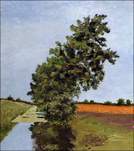
This large, bent tree is just one example—it doesn’t fit into a typically picturesque landscape. . .but it’s the truth, and Jiddje painted it exactly as it appeared.
If you’d like to see more of Jiddje’s artwork, or to keep up with his daily paintings, check out his website at www.Jiddje.nl.
This post may contain affiliate links.