Melissa B. Tubbs is a pen and ink artist from Alabama specializing in architectural drawings that are, quite frankly, mind-blowing.
Each of the following drawings are of New York landmarks and feature amazing line work, shading, and cross-hatching, as well as a great sense of composition.
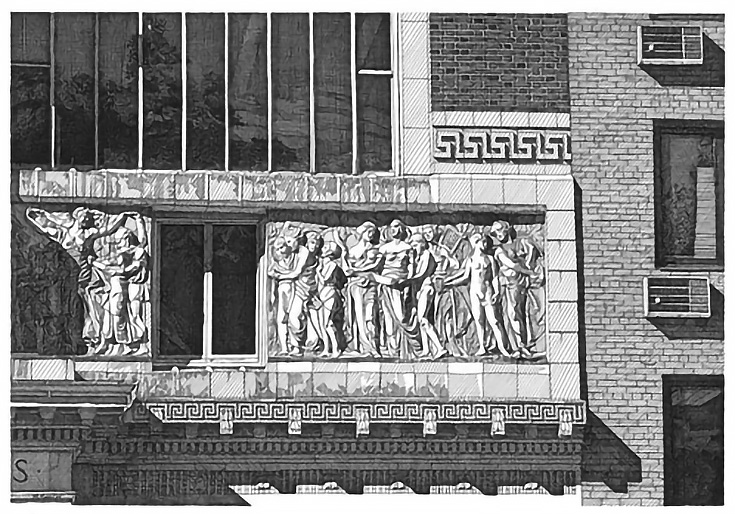
For instance, in Gainsborough Studios, NYC Melissa cropped down to just one section of a building in order to create the perfect geometric composition. Areas of dark and light are evenly balanced and the viewers’ eyes are continually pulled clockwise around, down, back to the left, and then up into the center of the drawing.
And one thing I love about super- or photo-realism is that there’s no picking and choosing which items you’d like to focus on. Notice how the A/C units are just as detailed as the statuary—it’s all important, every single detail in that drawing.
This next pen and ink drawing, Hunt Memorial, NYC, showcases Melissa’s ability to draw trees and dappled shadows as well as architectural lines.
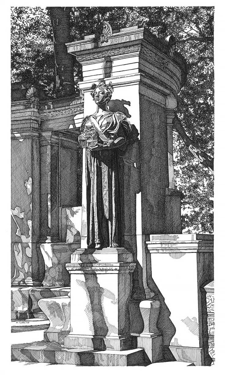
When there’s no color in a work of art, value (light and dark) becomes even more important, and with pen and ink getting value can be tricky. Above, Melissa has at least a full 10 levels of value represented just through different hatching methods.
And if you think that this kind of drawing is essentially human photography (i.e., more mechanical than creative), take a look at what Melissa did in Library Lion, NYC.
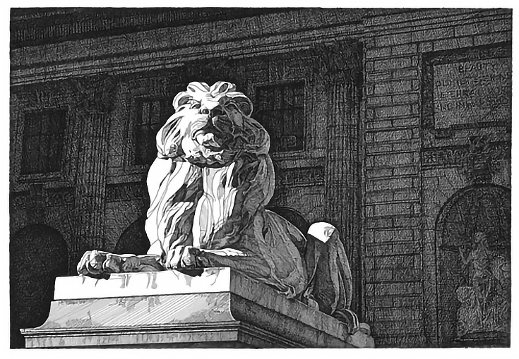
To enhance the effect of brilliant sunlight on stone, Melissa darkened the areas right around the lion statue, artistically pumping up the overall contrast of the piece even though it wasn’t that way in real life.
It’s something that people might not even notice, but it does make a difference.
To see more of Melissa B. Tubbs’ incredible pen and ink drawings, check out her website at www.melissabtubbs.blogspot.com.
This post may contain affiliate links.