There are times when I encounter a painting which moves me in a way that others do not. Something makes me pause, look closer, and become immersed in the visual excitement of the artist’s interpretation of their subject matter.
What explains that reaction? Usually it’s the artist’s creative use of color.
Color is what makes a painting stand out to me. Sometimes I’m drawn to bold color—color that vibrantly describes the elements in the composition. Other times I am fascinated by the muted palette of a quieter scene.
But most often, I am captivated by artwork and artists that make use of unique, non-traditional approaches to color.
So let’s look at a few examples of non-traditional color
Today we’re going to examine non-traditional color by learning from three artists who each have their own distinctive color palettes. I invited comments from Madeleine Kelly, Ron Morrison and Leslie Saeta because I find their artwork continually exciting due to their color choices.
Before reading what each artist has to say about color, please click on the links to their websites and take a few moments to view more of their paintings.
Madeleine Kelly – www.MadeleineKelly.com
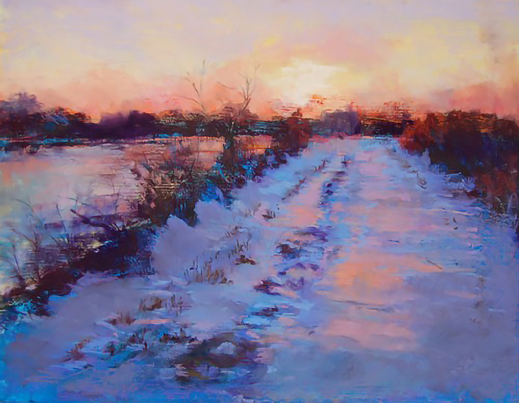
The pastel painting above is entitled “Path Tinicum” by Madeleine Kelly. Here’s what she had to say about her approach to color:
“I have no formal training in color. In fact, my art education consists of only a handful of workshops and classes that emphasized material techniques rather than color harmonies.
My approach to color is that I play with color. I like a vibrant palette because it creates drama. Most of my color choices are intuitive. Path Tinicum is painted using pastel over an acrylic underpainting with a pumice ground (my method is explained in April’s American Artist Magazine).
The idea [with this painting] was to push the envelope on a highly contrasted sunset photo reference. Although the cool shadows and warm sun in real life were high contrasts of almost black and salmon, it was the underpainting of the ground that pushed me to experiment with cool color combinations to avoid the black.
The most important thing is not to fear color but to experiment, which is a sure way to learn.”
Ron Morrison – WatercolourProductions.blogspot.com
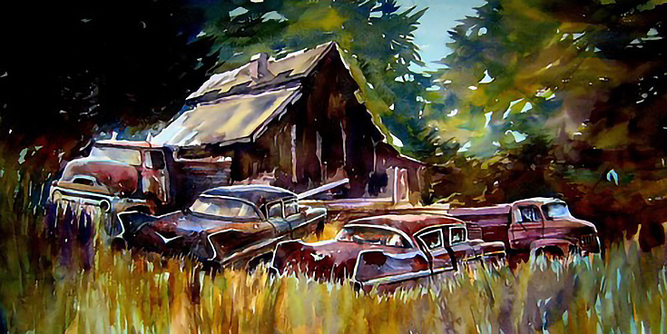
This watercolor is titled “Daylight Dawns With Nothing To Do” by Ron Morrison. His statement on color is below:
“I use a combination of color mixing on the palette and wet in wet on the paper. I glaze with thin washes and saturate and go back in and flood again.
I know enough about color theory to be dangerous but water management and good technique are more important to me. [Good] water management enables pigments to perform to their potential (or to at least approach it).”
I think I am freed to play with color in the context of composition, concentrating on values with the understanding that color is a natural extension rather than the basis of my painting. If the values read properly then the coloration should fall into place given a requisite level of competence with color mixing.”
Exploring a limited palette is much more fun for me than using every color on my palette and the more experienced a person is the more they can get away with. Today I mix colors happily that would have sabotaged my efforts at transparency in my early years of painting. Of course, avoidance of the “mud” peril is still a constant concern.”
Leslie Saeta – www.SaetaStudio.com
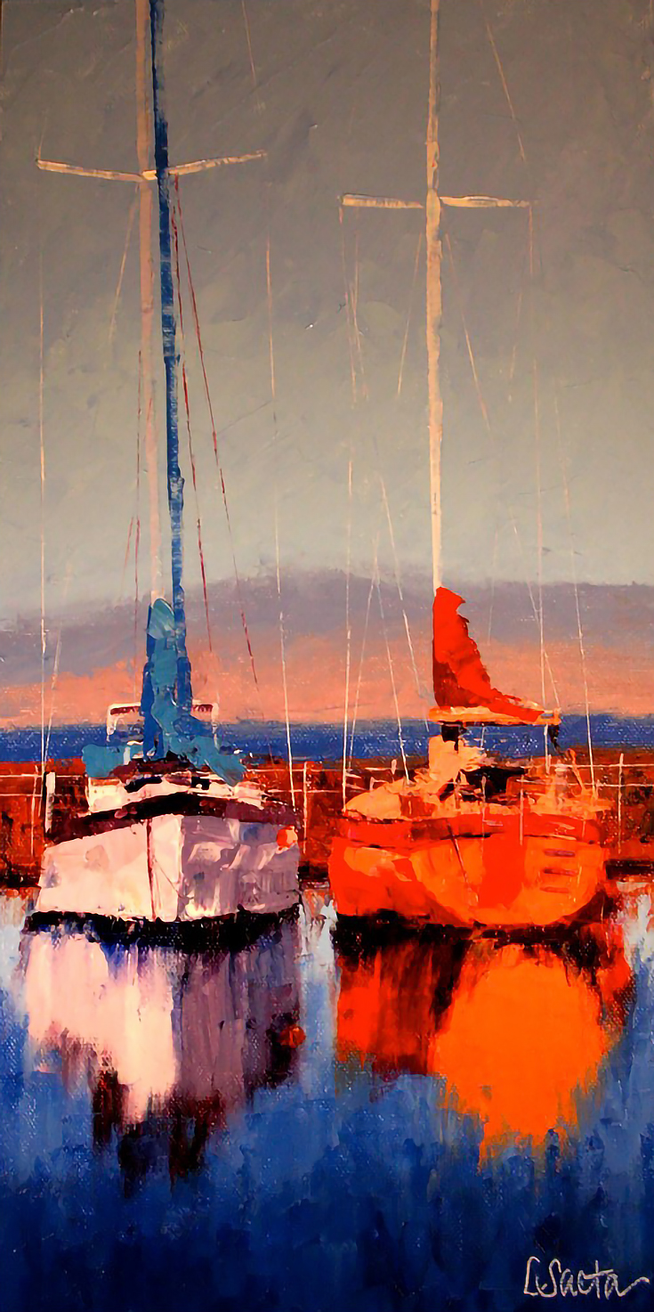
“A Friendly Sail” is one of the many vibrant oil paintings by Leslie Saeta. Here’s what she had to say about her palette and color choices:
“The colors that are always on my palette are Ultramarine blue, Cadmium yellow, Cadmium red medium, Sap green and Titanium white. With this limited palette I am confident that I can mix just about any color.
I always mix my colors before I begin my painting to make sure that the colors on my palette are harmonious. Before I start painting I always make sure I have at least two colors on my palette that are what I would call my “focal point colors.” Usually these are in the red or orange tones.
I am very aware that the colors I mix are bright. Since I paint exclusively with a palette knife, the only tools I use are my knife and a paper towel—no mediums. I usually wipe my blade after every painted stroke, so this allows me to ensure my colors are crisp and clear.
I paint a lot of boats and reflections in the water. In order to make the reflections “jump out of my paintings”, I enhance (and often change entirely!) the color of the boats and reflections that exist in the actual scene I am painting. I have tried to paint with more muted tones but I always end up scraping the canvas.”
I hope you’ve found our “virtual peek” at these artists’ palettes helpful in considering color in your own artwork. Next time you create, think about it. . . how can you make your use of color stand out?
This post may contain affiliate links.


