Paintings are all about color.
It should be obvious, because that’s the most significant thing that distinguishes paintings from drawings – and yet many new artists struggle with color and end up with gray, neutral paintings.
I was that way myself, early on. During my first semester of painting, the professor constantly hounded me for “more color.” Not that I was the only one. . . Many of us brought in homework that exemplified the three B’s: beige, boring, and blah.
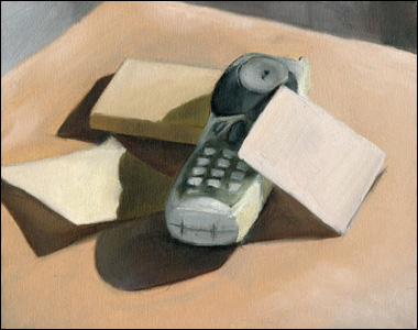
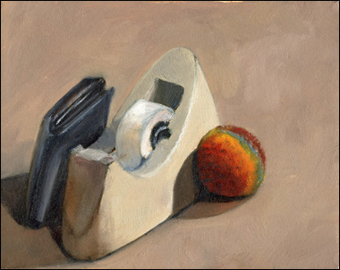
Here are some of those early paintings of mine. They’re all on small 8×10 inch canvases and painted from simple still life scenes I set up.
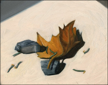
You can see what I mean by the three B’s. The range of color is very limited (mostly creams, whites, and gray/blues), and the shadows all go straight to black or gray.
For several weeks I turned in assignments that were essentially lifeless. Although I knew several techniques for drawing realistically, my paintings suffered horribly from a lack of intensity and color.
However, once a few more weeks went by I began to learn what was keeping my paintings from being successful.
1. I was painting the wrong stuff
As an artist I had complete control over what I painted, but I made the same mistake over and over again – I always painted neutral objects. Finally it dawned on me that interesting paintings should have colorful subjects, so I began painting the most vivid items I could find.
Even if you’re just doing basic exercises for a class like I was, I’d suggest painting from something colorful. It’ll be much more enjoyable to look at when finished, as well as more fun to make in the first place.
2. My eyes were halfway shut
No, I’m not joking. In fact, you might even be the same way. Growing up I always squinted my eyes to “see better” while drawing. Just a habit, but one that ended up affecting how I paint.
You see, when squinting, your eyelids and eyelashes close in around your eyes, not only blocking out some of the light, but also neutralizing colors! I still catch myself doing it occasionally, and have to deliberately open my eyes to see the colors I missed.
3. I was being too honest
I remember my painting professor saying something like, “With color, sometimes you just have to lie.” And you know what? It’s the absolute truth. We’re so USED to color that we only really think about it in extraordinary situations.
But when you’re painting, search for all the color that you normally wouldn’t notice, and emphasize it. Lie about it. Make sure others see it. It might seem crazy at first, but if your paintings are turning out boring or dull, consider being a little more “deceptive” by taking the color into your own hands.
It’s amazing what happened after I figured out exactly what was holding me back in regards to color, and by the end of the semester my paintings changed dramatically for the better. Here’s my final project for that class.
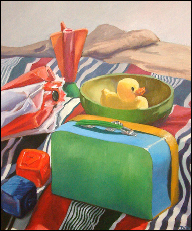
It’s an 18×24 still life titled Child’s Landscape. Although it’s not perfect, I still consider it my first truly successful painting.
This post may contain affiliate links.