As a calligrapher, I’m often looking for easy ways to accomplish design tasks. One project I repeat quite often is making name cards for students and events. It’s a nice way to welcome those attending because everyone enjoys seeing their name, but it does take time.
I’ve also been an avid collector of rubber stamps for many years, so it’s been wonderful to see a revival in their use for cards and creative projects. In this 2-part series, I’d like to share a few ways that stamps can save you time and enhance your lettering:
1. Start with visually interesting stamps
When purchasing rubber stamps, look for either an interesting area of white space or an interesting outline. This will help you go beyond basic stamping by adding a strong element of design to your pieces.
2. Aim for a similar look in your lettering and stamps
In this first example, I was teaching a Medieval Art class featuring the calligraphy from that period, called uncials, which were written with a quill:
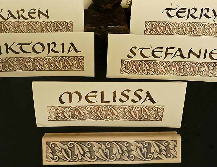
I was glad I had an acanthus leaf border from that time period to accent the lettering, because it fit the style perfectly.
NOTE: It’s also important to consider color—here, brown and copper blended nicely on ivory cover stock. All of these considerations work together to give unity to the project.
In these floral cards below, shades of lavender and green gave traditional color to the white cards and looked spring-like for the April class.
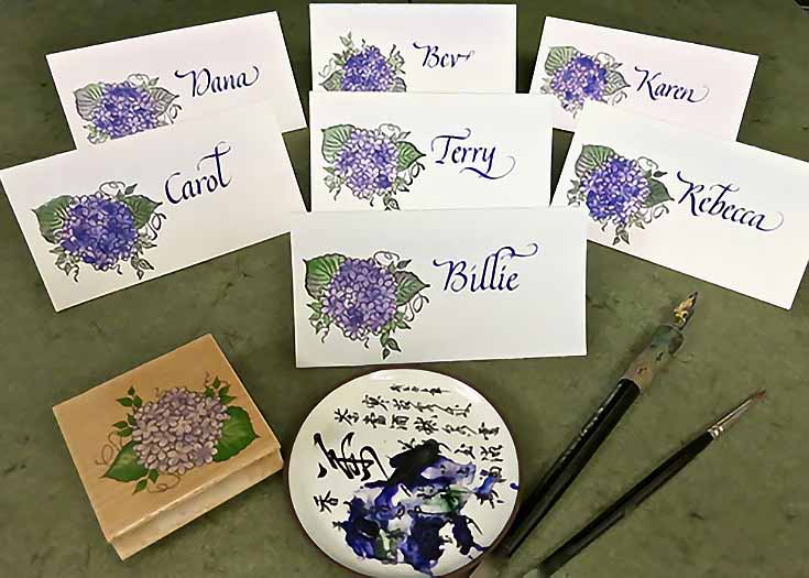
My process is as follows: first I stamp the image on my card, pressing firmly and evenly, then trim. After that, I letter the names, and finally add color (if necessary) over the stamped image. With stamps, any kind of watercolor, gouache, colored pencil, or pastel works nicely!
3. Smooth paper works best for clean stamping results
Place a thin rubber pad beneath your paper if you have one (or just use a pad of paper) to give the stamp a little cushion and help the ink to transfer evenly.
On the other hand, a “grunge” look—a.k.a., a splotchy result—can sometimes be really fun, too. Stamping on a hard surface will usually give you this more irregular result.
4. It’s OK to use several stamps, even on small cards
I used four stamps on the fall cards below: two different sizes of pumpkin stamps, a smile face (in the middle of the big pumpkin) and a black cat. For color I used pastel.
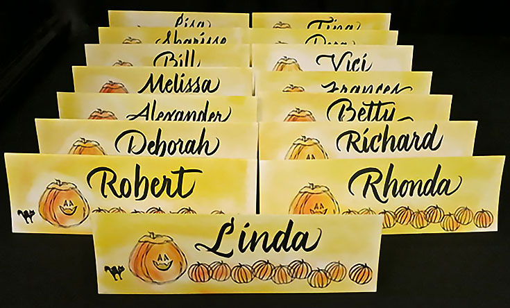
NOTE: Outline-only stamps actually offer more freedom to add color or even texture. For example, if the inner lines had not been in the pumpkin stamp, I could have quickly drawn them in.
In addition, if you have a smaller stamp than you need, repeating it across the paper is always an option, especially for borders. You’ll recall from my previous articles that repetition is a design element. Use it!
5. Store your stamps according to season or images
The labels on my metal stamping boxes read “birds,” “flowers,” “hearts,” “summer,” and “snowflakes” to name a few. As you can see above, I tend to collect stamps for all seasons, and then use them accordingly.
I hope you’ve enjoy these stamping tips! Visit my Facebook page for ideas and tutorials, as well as information on my classes and events in Northern California.
This post may contain affiliate links.