It isn’t by accident that I teach students brush illustration before we begin working on the ABC’s. There’s a little silence when I mention the word “illustration,” followed by a sense of confusion and fear.
After all, they came to my calligraphy class to learn to make beautiful letters.

I can hear the whispers: “I don’t know how to draw. . .” They’re probably thinking, “What does illustration have to do with calligraphy?” Well it might seem sneaky, but calligraphy is drawing. The same pen that draws beautiful letters can also make companion images.
And I confess, I wouldn’t even be teaching lettering if it weren’t for brush illustration . . . Way back when, I’d taken a weekend workshop with a famous master and came home devastated. I thought I’d never be good at it. I’m a graphic designer, but I’ll pass on brush lettering, thank you!
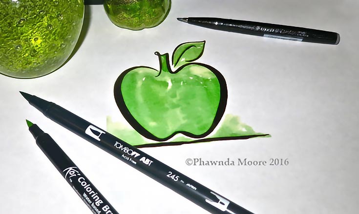
Then one day, I picked up the brush and began to make simple things—an apple, a pear. And for a couple of decades, companies hired me to draw images for health care, food, and wine.
Only after that did I get serious about letters. . . and I think that you, too, will find that learning to draw with a brush first makes lettering much easier!
Here are five easy steps to help you get started off right with brush illustrations:
1. Buy the right brush pen
You’ll need a brush marker that was designed specifically for calligraphy. I recommend the Tombow, hands down, for beginners. It’s a big brush and you’ll learn a lot from it. Also good: Koi, Zig Brushables, and Pentel Fude Touch.
2. Drawing on copy paper is fine!
I love Hammermill Color Copy Digital, but you can use whatever smooth stock copy paper that you have on hand.
3. Start with some simple freehand drawings
This is a case of “getting to know your brush!” Play with it; see what it will do.
Begin with a few simple lines: try light pressure at first, then slowly increase the weight of your hand holding the brush to make thicker, more substantial lines.
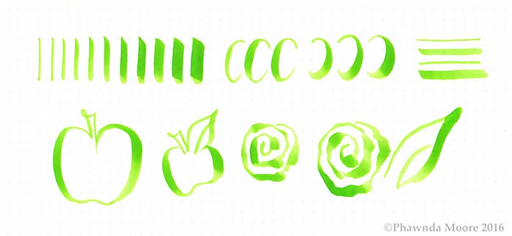
Move on to some curved strokes, as well as horizontal strokes. Then, when you feel comfortable, experiment with a few simple shapes—like an apple, or a leaf. As you vary your pressure, you’ll notice them start to come to life!
4. Or, add to an existing illustration
If you “don’t draw,” borrow from someone who does. Try coloring books or simple photographs. Your goal is to simply add weight to some of the lines on the paper.
Select just a few lines you want to emphasize and thicken them; you don’t need them all to make an interesting illustration.
5. Lastly, be in the moment
Allow time for your heart, hand, eye, brain and breath to get in sync. Breathe between strokes. And. . . Go. . . . Slowly.
I’ll repeat that: slow down and enjoy the experience. You’re about to draw!
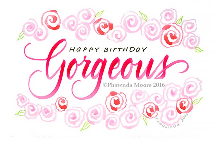
For this “gorgeous” card below, I made the rose border with two colors of marker pens. It’s really easy to do! With practice, I learned over time that shape, not the details, is important. Keep it simple.
I hope you enjoyed this little tutorial and found some good techniques to try on your own. I’ll be sharing more about brush lettering in a later post, but you can also see more illustrations at my Facebook page: Calligraphy & Design by Phawnda.
Until next time!
This post may contain affiliate links.