In my last article I described how I started a drawing of a landscape at sunrise. If you missed that article, or if you would like to review it, you can read it here.
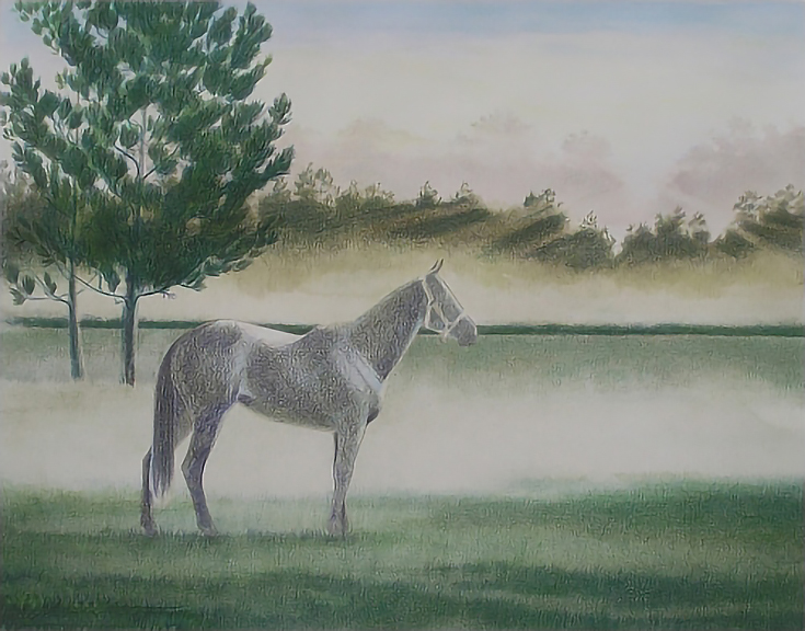
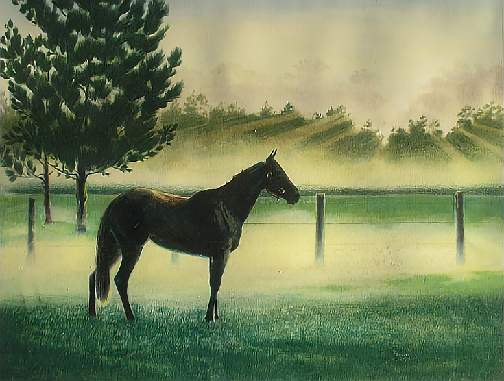
This what the drawing looked like at the end of that article. Today I’ll be demonstrating how I finished it.
Like last time, I’m using a combination of pencils and methods including water soluble Faber-Castell Art Grip Aquarelle, traditional Faber-Castell Art Grip, and Prismacolor Premier. Today I’ll also be using Prismacolor Verithin pencils.
Let’s get back into it!
Step 1: Finishing the meadow
I shaded Faber-Castell Art Grip Aquarelle (water soluble) Van Dyke Brown and Deep Cobalt Green throughout the foreground and into the middle ground using medium pressure and vertical strokes. At the back edge of the foreground (just below the fog in the middle ground), I glazed Deep Cobalt Green in horizontal strokes with lighter pressure and the side of the pencil.
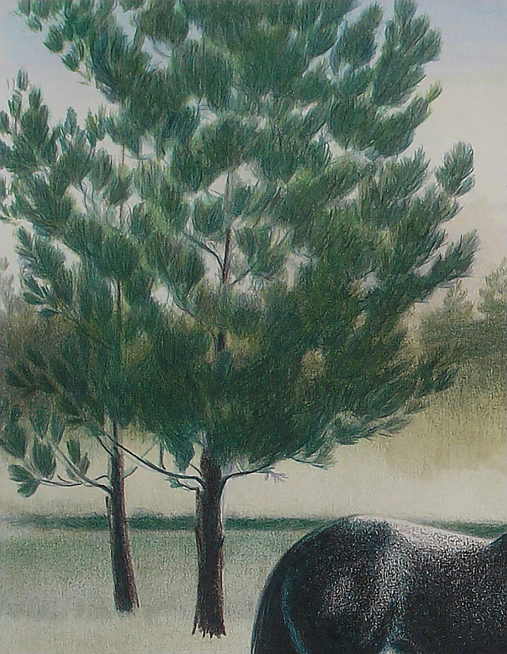
Then I switched to Faber-Castell Art Grip traditional pencils, beginning with a layer of Permanent Green Olive over the foreground, the line of trees visible beneath the fog belt, and the pine trees.
In the next phase, I layered Permanent Green Olive, Black, Delft Blue, and Emerald Green over the pines and foreground grass, followed by Prismacolor Thick Lead Metallic Green in the pine trees. I chose that color because its a dull, muted green and I thought it would be a good color for suggesting fog. It did work that way, but didn’t cover very well. I finished the pines with Peacock Green.
The areas in the foreground that I tried to “wash” earlier (see part 1) didn’t turn out well and has never looked right, so that area needed to be corrected.
I began by layering Peacock Green over the entire area, followed by Olive Green and Grass Green. I would have used Dark Green next, but didn’t have any, so I used Indigo Blue applied with medium to heavy pressure. The darker color covered the problem area very well.
But what really did the trick was burnishing with Peacock Green. I ended up doing all of the foreground in short, blunt vertical strokes with heavy to very heavy pressure. I left the strokes open so some lighter and darker areas showed through, but I covered the entire area below the horse and worked up into the area just beyond the horse.
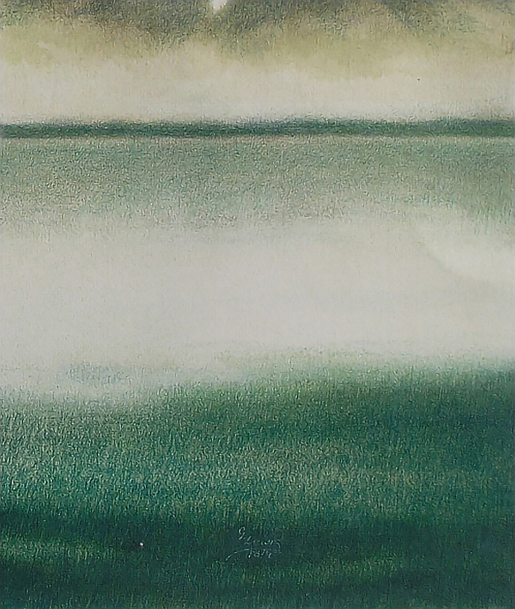
The further into the background I moved, the lighter the pressure I used, until I was using light pressure in the areas that disappear into the fog.
Step 2: Adjusting colors and values
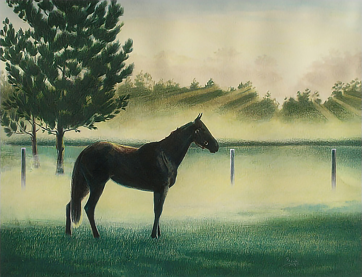
I worked throughout the entire drawing, but focused mostly on the horse and the pines, both of which needed to be darkened. These areas were darkened by layering Dark Green and Black Grape and using medium to heavy pressure. On the horse, I also used Sienna Brown.
I also adjusted the middle ground by adding a vertical glaze of Dark Green to the lightest areas on each edge of the painting and darkened the trees in the background with Dark Green, in order to emphasize the sunbeams.
I wanted to make sure I was getting the background right before considering the landscape finished. I finished the fog belt in front of the trees with Lemon Yellow and White, both of which I also stroked into the sunbeams to increase the contrast between sunlight and distant trees.
Step 3: Finishing the horse
I finished the horse by applying a heavy layer of Dark Brown, then blending it with rubbing alcohol. I followed that with heavy layers of Indigo Blue and Black, a few touches of greens and yellows around the back lit edges and another blending with rubbing alcohol.

BLENDING TIP: When blending, I poured a small amount of rubbing alcohol into a small container, dipped a clean cotton swab into the alcohol, then rubbed the swab over the parts I wanted to blend. Choosing a swab instead of a bristle brush keeps the blended edges soft and blurred. And, using a swab instead of a cotton ball allows me to work in smaller areas.
Step 4: Adding more details
The last thing to add was the row of fence posts and the fence. I liked the drawing without them, but for this particular drawing I had a client who wanted the fence posts included.
I drew the posts using random mixes of French Grey 20%, French Grey 70%, Warm Grey 30%, Warm Grey 50%, Sepia, Dark Umber, Black, Indigo Blue, Black Grape, Peacock Green, Cream, Jasmine and Lemon. I next layered Cream heavily over the foggy area, working over parts of the posts to push them into the fog. Next I blended with rubbing alcohol.
I wanted to see if I could add better highlights after blending with rubbing alcohol, but there was too much wax on the paper. So after the paper dried, I gave it one or two light coats of retouch varnish to restore the paper tooth. Once the retouch varnish dried, I worked over the posts again, brightening the back lighted edges and darkening the darkest shadows.
Step 5: Putting in the final touches
The last remaining work was adding the fence stretching between the posts. The lower strands are barely visible through the fog and the upper strands are barely visible because they are close to the same value as the background.
Because I needed an extremely fine, uniform line, I selected a Verithin pencil. The Verithin line is comprised of wax-based pencils manufactured by Prismacolor. They have a very thin, hard lead, so the pencils can be honed to a very sharp point which they hold extremely well.
I used a straight edge with a dark Verithin to draw in each strand of fencing. Then I worked over the lower strands with Cream, Jasmine, and just a hint of Lemon to push them more deeply into the fog.
Ordinarily, I let a finished drawing sit for as much as week just to make sure there are no other corrections to be made. But this was a Christmas portrait and the deadline was rapidly approaching, so I fixed the drawing with another coat of retouch varnish and it was ready for the client.
This post may contain affiliate links.