In today’s article I’ll be using traditional colored pencils to finish a project that began with a drawing in water-soluble colored pencil.
I started this drawing using brushes and a homemade “palette” of colors drawn with the water-soluble pencils. If you haven’t read the first article yet, I encourage you to click the link above and then come back here to finish reading about the process.
Step 1: Grass, shrubs, and trees
I began by laying down Limepeel and Raw Umber with medium heavy pressure to create a base green in all the landscape greens. I then used heavy pressure to layer Olive Green into the middle tones and Olive Green and Dark Green into the shadows in the shrubs on the left.
The small background shrubs were finished with touches of Cream, Chartreuse, and Yellow Chartreuse as accent highlights, followed by a glaze of Raw Umber to tone down the greens,
With the large shrubs, I darkened the shadows with Dark Brown, Dark Green, and Indigo Blue using medium heavy pressure. The middle tones were glazed with Apple Green and Chartreuse, and the highlights with Chartreuse, Yellow Chartreuse, and Cream. I used squiggly lines to duplicate the look of foliage without creating a lot of detail. The texture of the paper, which is a 300 lb. watercolor paper, contributed to the look of foliage.
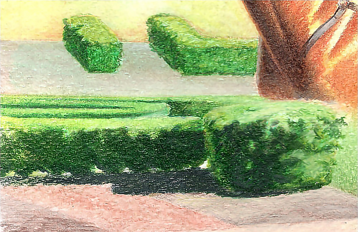
In the grass, I used Olive Green and Jade Green applied with short vertical strokes and light pressure. I finished with heavy applications of Verithin Grass Green, Olive Green, and True Green burnished with Prismacolor Lemon Yellow. Over that, I applied Apple Green, Limepeel, and Cream. In this illustration, the blurred areas were burnished with Cream. The other areas are unburnished.
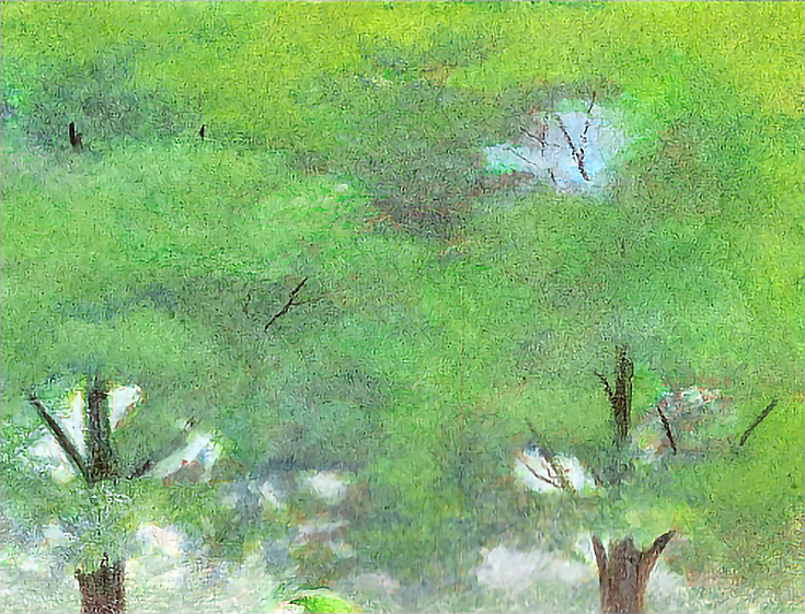
I finished the trees with Apple Green, Limepeel, Olive Green, Dark Green, and, in the darkest shadows, Dark Brown and Indigo Blue. I kept the color mottled and the edges between highlights and shadows soft.
Step 2: Dirt and track
Around the small shrubs, I used Raw Umber and French Grey 20%, then burnished Cloud Blue at the top and patches of White throughout. I used the colorless blender in some of these areas and worked with the texture of the paper to simulate the texture of dirt.
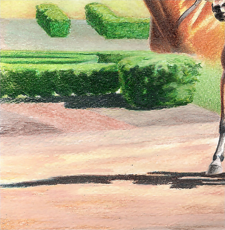
In the brown areas around the large shrubs, I used Raw Umber and French Grey 20% overall, then added Dark Umber, Dark Brown, Indigo Blue, and Dark Green in the shadows; and Light Umber, Dark Brown, and Cream in the sunlit areas. Each color was applied with heavy pressure and the area was finished by adding highlights with White.
In the red strip, I used Light Umber and Terra Cotta with medium pressure. In both areas, I used the texture of the paper to simulate the texture of the ground cover.
The track was nearly finished with water soluble color, so all I had to do was apply Terra Cotta, Light Umber, Dark Brown, Cream, and French Grey 20% with the sides of the pencils and medium pressure.
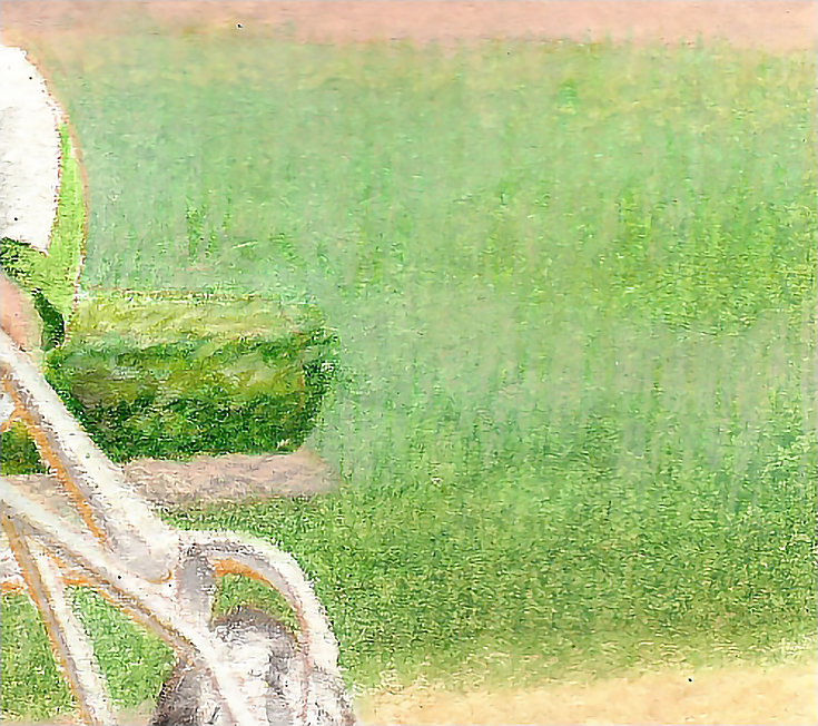
Step 3: Driver and racing bike
For the skin tones, I used Flesh, Light Umber, and Sand in the middle tones and light areas and Light Umber and Warm Grey 70% with touches of Grass Green, Olive Green, and Dark Brown in the shadows. Because the artwork is so small (8×10), there wasn’t a lot of detail, so I concentrated on getting the basic shapes and shadows correct.
I did the goggles with a combination of Black and Indigo Blue, with a touch of Non-Photo Blue burnished with White on the left side, where the curve of the goggle reflects the sky.
The greens in the jercey and helmet were done with Grass Green as a base color, Olive Green and Dark Green in the shadows and White burnished into the sunlit areas. I used the same colors and process in the green saddle pad.
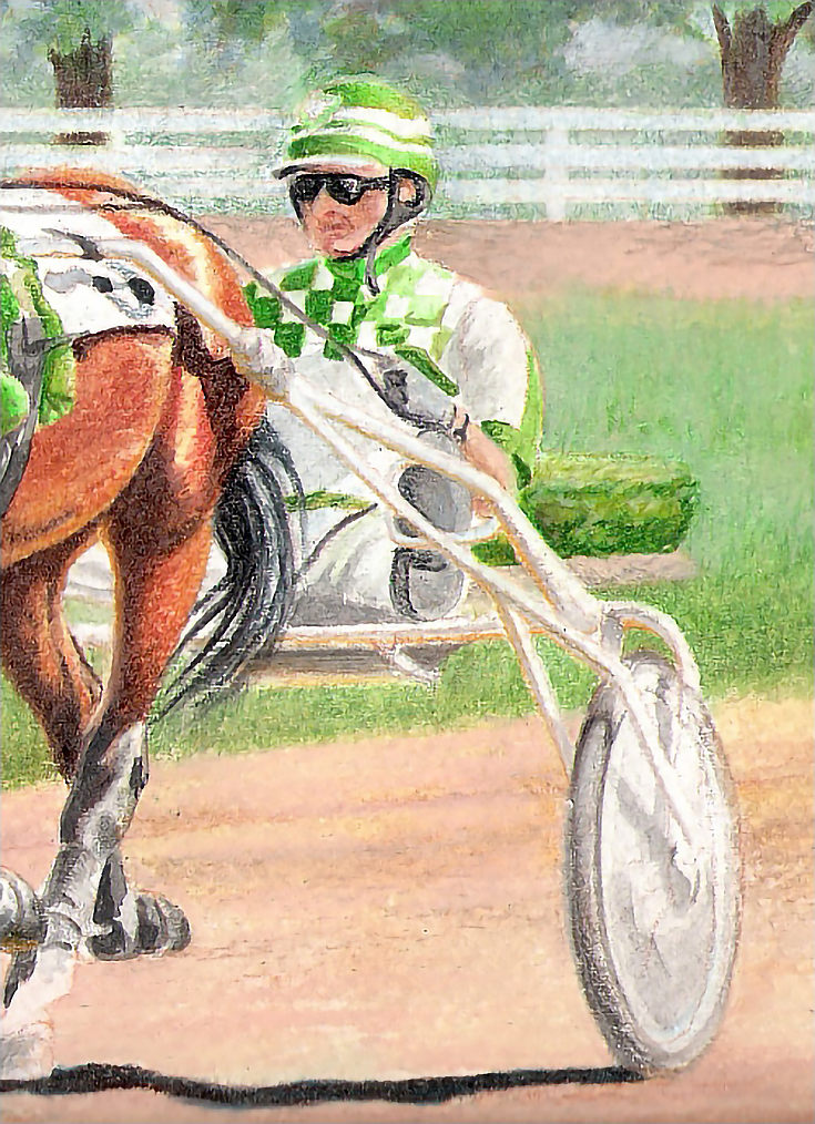
Since the racing bike is white, most of the work there was in the shadows and in reflected light from the ground and sky. I used Yellow Ochre burnished with White for reflected ground light and Non-Photo Blue burnished with White for reflected sky. Shadows were French Grey 20% applied with medium pressure and burnished with the colorless blender.
The shadows inside the wheels were finished during the wet phase, so I added shadows around the hub and rim. The tires were finished with curving strokes following the curve of the tires. I used French Grey 20%, French Grey 50%, and French Grey 70% and blended (but not burnished) with White, then added a few accents of Yellow Ochre where the tire on the right meets sunlit ground.
Step 4: Horses, harness, and bridles
I worked mostly from light to dark. I began with Canary Yellow as the base color, followed by Yellow Ochre, Goldenrod, and Orange in the highlights; Terra Cotta, Orange, and Burnt Ochre in the middle tones; and Dark Brown, Ultramarine, and Black in the shadows. With each layer, I increased the pressure slightly, starting with light pressure. I blended with the colorless blender to finish.
For the blacks in each horse, I used a combination of Verithin and Prismacolor Black, White, French Grey 20%, French Grey 50%, and French Grey 70%. I added cool blue highlights with Light Cerulean Blue and White. I used medium to heavy pressure and directional strokes.
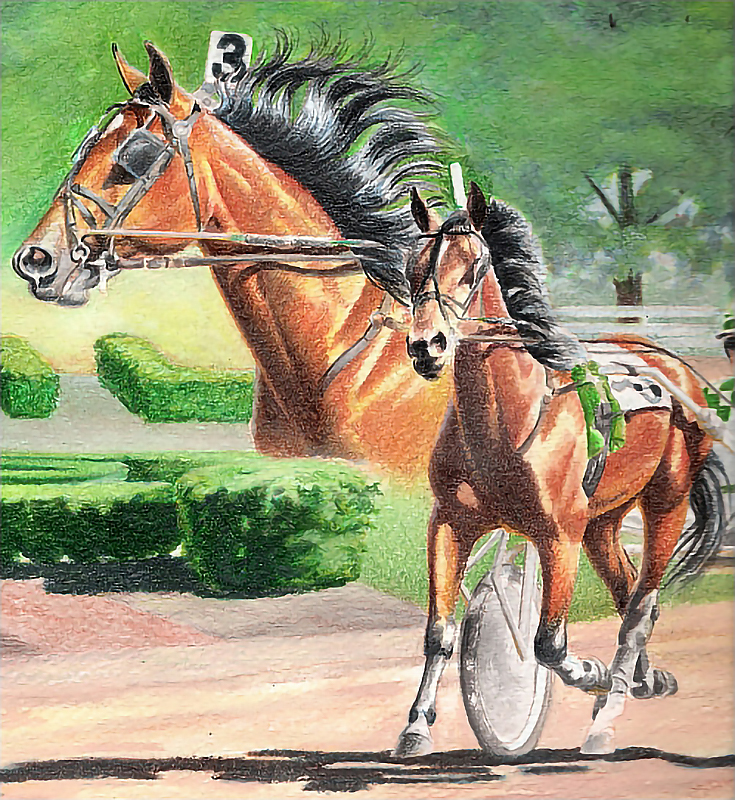
I used much the same process and combination of pencils with the bridles and harness: Verithin Black and White, and Prismacolor White, Bronze, French Grey 20%, and Sky Blue Light. I did all of the straps, the blinkers, and as many buckles as possible using heavy pressure, almost burnishing color into each area.
Wherever possible I used directional strokes and as few strokes as possible. For example, on the reins, I stroked along the length of the rein with a light color to make the highlighted edge, then filled in the rest with darker colors.
Step 5: Final adjustments
When each area had been finished, I went back over the entire image and made adjustments as necessary; mostly adding highlights and darkening darks to enhance value range and adjusting for color unity as needed.
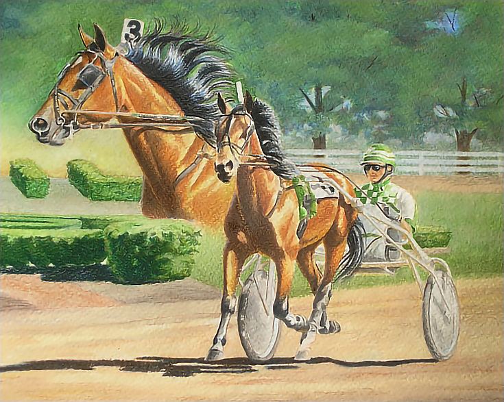
The final result, seen above, contains both soft elements from the water-soluble under-drawing, and crisp detail from using traditional colored pencils.
This post may contain affiliate links.