Today I’ll be finishing the limited palette colored pencil portrait demonstration that I began a few weeks ago. I’m using Rising Stonehenge 90 lb. paper in a medium light brown “Fawn” color, with Prismacolor Thick Lead pencils.
The first article deals with the limited palette under drawing, and is important to understanding this demonstration. You can read it here if you haven’t already.
Step 1: Drawing the eyes
Colors – Prismacolor Black, White, Dark Brown, Mediterranean Blue, Indigo Blue
Beginning with Black, I outlined then filled in each eye and added color to the rims and lower lids, leaving a narrow area at the bottom of each eye for the iris.
I followed up with layers of Dark Brown in the iris, and Indigo Blue and Mediterranean Blue in the pupils and rims. Black and Indigo Blue were layered over the pupils and rims and the highlights were ringed with Mediterranean Blue.
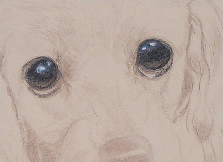
Color was applied with medium pressure until the last layer of black, which was applied with medium-heavy pressure. I also sharpened my pencils often.
Step 2: Adding color and texture to the face and ears
Colors – Prismacolor Dark Umber, Salmon Pink, White, Cream, Mineral Orange, Pumpkin Orange
I worked out the details of the face and ears with Dark Umber, beginning with the eyes (the most important part of any portrait). I also added detail and middle tones around the face, muzzle and ears. I used a light pressure, but kept the pencil sharp and held it in a vertical position with directional strokes to simulate hair patterns.
Next I glazed Salmon Pink over the middle tones and shadows using the side of the pencil and very light pressure. I followed up with White in the highlights and Cream around those highlights, using a dull pencil and medium pressure for both colors.
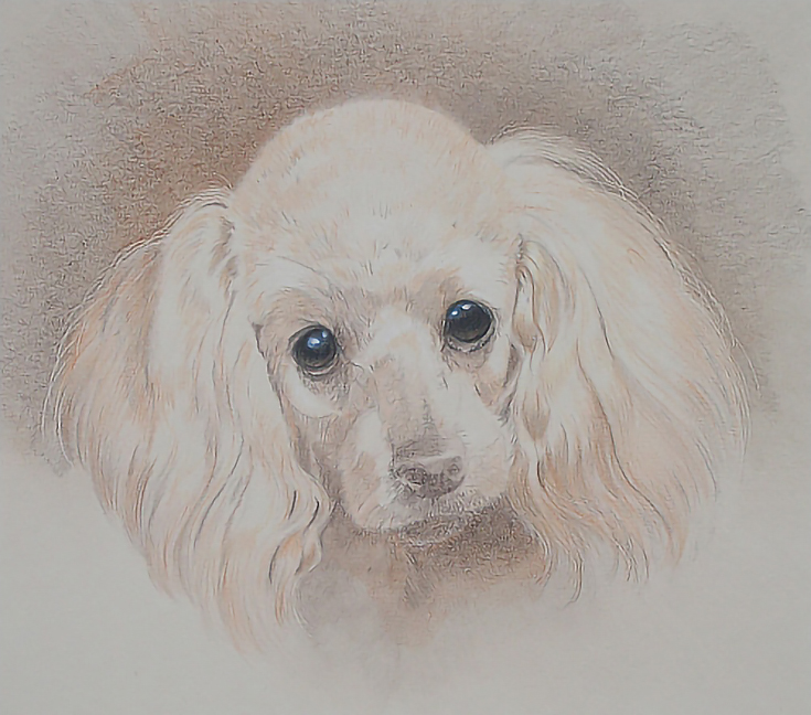
After that, I added Mineral Orange throughout the dog, beginning with the ears and working into the face. This color is the base color so I used light pressure and fitted the strokes to whatever areas I was working in. Long strokes for the ears, short directional strokes around the face, and stubby strokes in the hair on top of the head. I used light pressure.
I followed that with a similar application of Pumpkin Orange in the darker areas, using the same strokes and pressures. I also glazed Pumpkin Orange over the background.
Step 3: Darkening the background
Colors – Prismacolor Dark Brown, Indigo Blue, Terra Cotta, Black
I worked on the background, layering Dark Brown, Indigo Blue, Terra Cotta, and Black in alternating layers, but varying color application so that the overall color varied throughout the background.
After three or four layers of each color, I mounted a 7×9 inch working mat to the portrait, then filled in the background along the top and about ¾ of the way down each side out to the edges of that mat.
I used light to medium pressure for most of the work. Sometimes, I used the sides of the pencils and held them at the end to allow for a lighter pressure and freer application. Sometimes I held the pencil vertically. I used directional, hatching, cross-hatching, and circular strokes. The objective was to get the best possible coverage to finish this area, so I used the most suitable technique at each stage.
Step 4: Background blending
I blended the background with rubbing alcohol and a cotton swab. Because the paper (Rising Stonehenge) is soft and absorbent, I wetted the paper a couple of times to thoroughly blend the colors. I didn’t saturate the paper, but used a combination of strokes to apply the rubbing alcohol. The only stroke I didn’t use was a circular stroke.
I also used light pressure so as not to scrub the paper and risk scuffing the surface.
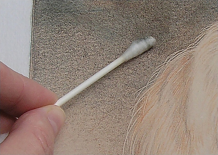
When I was finished, I set the portrait aside to dry thoroughly.
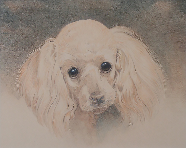
Step 5: Adding the final details
Colors – Prismacolor Dark Umber, Raw Umber, Black, Terra Cotta, Beige, White, Cloud Blue
I began adding value, color, and detail in and around the eyes, working outward throughout the face. I used Terra Cotta and Raw Umber to darken some of the values in the face and ears, using light pressure, sharp pencils, and directional strokes.
In and around the eyes, I used Black, then Dark Brown, adding Cloud Blue and White to brighten the highlights in each eye and the lower lid of the right eye.
I outlined the nose with Terra Cotta, then layered Terra Cotta with light pressure over all but the highlights. Then I alternated layers of Dark Brown and Black with medium to heavy pressure and circular strokes. The highlight was lightly shaded with Raw Umber, then rimmed with Cloud Blue and burnished with White. The rest of the nose was burnished with a combination of Raw Umber and the colorless blender.
I darkened the hair around the nose and on the chin, but used light pressure and directional strokes with no burnishing.
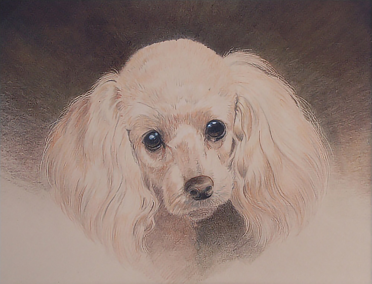
When the face was finished, I layered Dark Brown and Raw Umber over the background. I used medium to heavy pressure with both colors, then burnished the dark brown areas with Raw Umber and all the other areas with the colorless blender.
At that point, I felt like the portrait was complete. I reviewed it the following day and decided it was, indeed, finished.
The final step before framing will be removing wax bloom (which developed quickly because of the dark colors and heavy pressure) and putting a light coat of retouch varnish on the portrait to prevent the development of additional wax bloom.
Conclusion
This portrait is an excellent example of using a limited palette on colored paper. Incorporating the color of the paper into the subject saved me a lot of time and effort, and brings the added benefit of tying everything together into a single, unified whole.
This post may contain affiliate links.