It’s all too easy for beginning artists (and many experienced artists as well) to undervalue the importance of understanding color theory.
When I was first starting out, I bought many tubes of paint and relied heavily on “convenience” mixes in lieu of mixing my own colors. Mixing just seemed so complicated! Plus, I felt that color theory was not only boring but over-rated. I could not have been more wrong!
Like many creative individuals, I was impatient to get to the fun part. However, by neglecting to educate myself on color (or even experiment in it) I actually slowed my progress as an artist.
Of course, even when you understand very little about color theory, paintings sometimes do result in unexpected success. One of my early paintings is a good example of how I unintentionally applied an analogous-complementary color theme.
(Analogous colors are neighboring colors on the color wheel, and complimentary colors are directly opposite each other on the wheel.)
In the case of Boys on The Beach, below, my analogous colors are blue-green, blue, blue-violet and violet. All of those colors sit right next to each other.
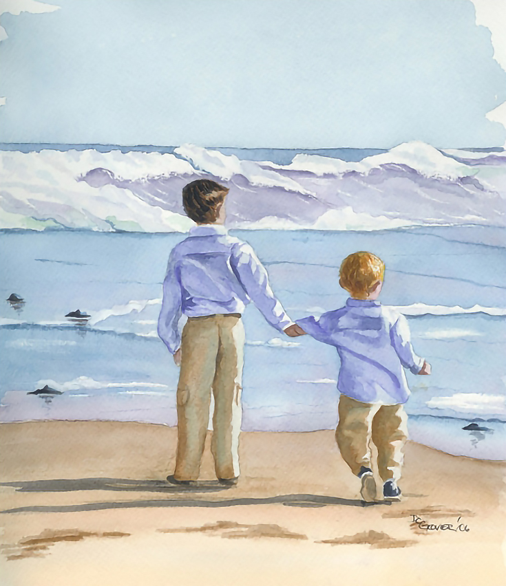
The complement of blue is orange, which I incorporated into the sand and in touches on the boys’ slacks.
Although I now see areas where this painting could be improved, overall I was pleased with it. Only later did I realize that the main reason for my satisfaction was my unintentional use of a highly successful color theme.
An introduction to color triads
As you probably know, all colors can be mixed using the three primary colors. If you understand color theory, you can complete entire paintings with only the primary colors on your palette—red, yellow, and blue.
Of course, one of the best ways to learn about mixing colors is to limit your palette to just those three colors, and experiment!
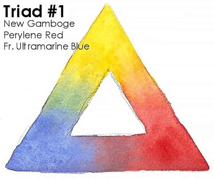
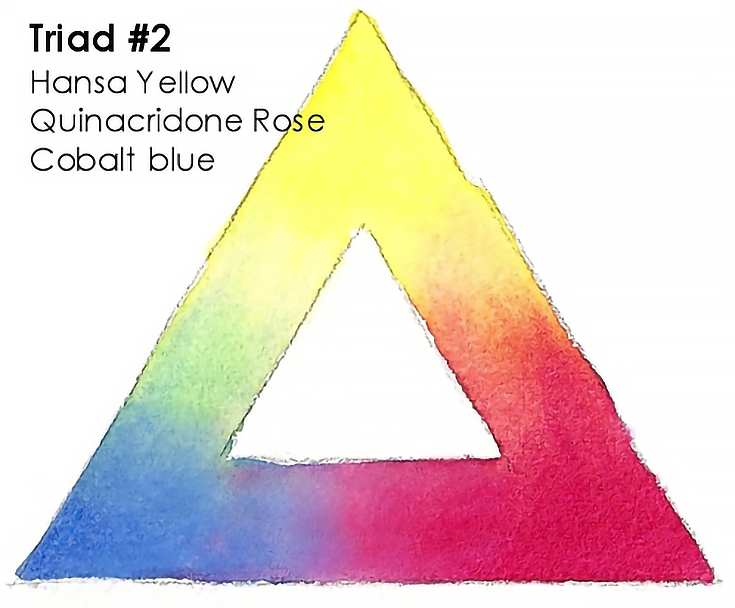
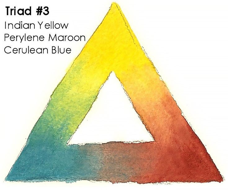
To illustrate this, I recently did three nearly identical paintings using three variations of that basic red-yellow-blue triad.
Here are the three triad variations I chose:
With my triads chosen, I painted three simple holly watercolors. Here’s how they turned out:
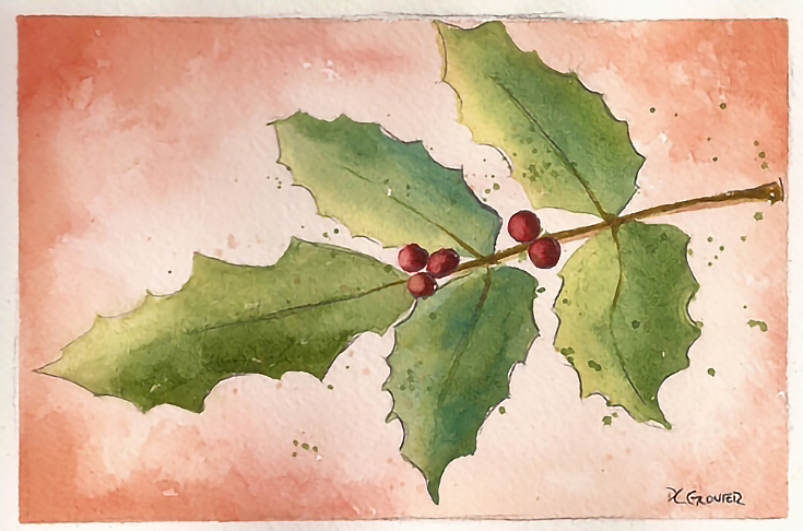

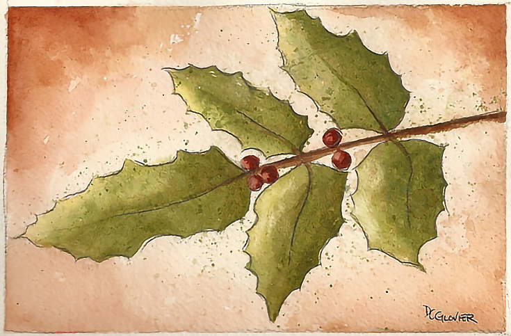
The differences are subtle, but as you can see, each triad created a slightly different spectrum of colors. My greens shifted from blue-green to yellow-green to brown-green, while the reds leaned either towards orange or maroon.
And there are nearly unlimited triad combinations available. I urge you to try this exercise yourself—create your own color triads and experiment with the colors schemes you can create.
Just like an analogous or complimentary color scheme, the color triads you choose will always affect the mood and outcome of your paintings. By understanding how these color combinations work together (and which ones you prefer for yourself) you will gain that much more control over your final artwork.
This post may contain affiliate links.