"Profiles in Black and White" is my on-going series of drawings observing various forms in profile. The techniques I use in producing these drawings range from the traditional handling of the pencil to a glazing technique using powdered graphite to enhance darks. Here are a few tips:
1. Use an architectural pencil (a lead holder) so you can continually keep a sharp point while drawing. I suggest a range from HB to 9B. I rarely use the H’s as their color is less rich and has a shiny appearance.
2. Choose your paper carefully for the amount of graphite it can hold—I am using Stonehenge’s print making paper. It doesn’t have the sizing of a watercolor paper so it really soaks up the graphite, allowing me to get more graphite on the paper at once.
3. Begin your drawing by lightly blocking in your subject, then start massing (adding) in the major forms. Let the large shapes of light and shadow guide you, detail comes later. Work the whole drawing, don’t linger in one area. Bring the whole drawing along slowly, much like a photo developing in a darkroom tray.
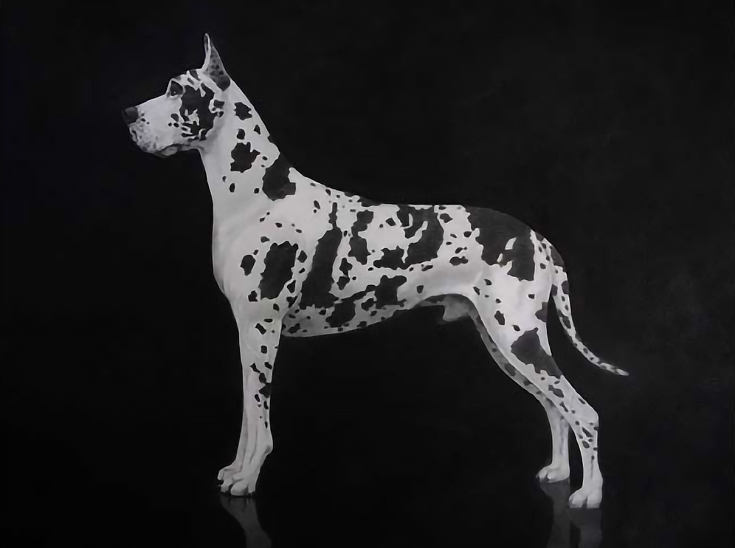
Great Dane, black tie, graphite on print-making paper.
4. Once your drawing is well along, and you can see all the major shapes of your subjects, it’s time to fully develop the darks in the background. You do this so that you have something to compare the rest of your values to.
5. When creating your deepest blackest values, patience is the key. Work your pencil and powdered graphite very lightly, caress the paper. You will get your darkest darks by building up multiple layers of graphite, maybe as many as 20 layers.
6. For graphite powder, I grind my own using a mechanical pencil sharpener and 6B, 8B, and 9B leads. Bottled graphite powder that you can purchase is just not as rich. Find a soft cotton cloth to use when applying the powder. Use a buffing technique, much like hand buffing or waxing your car.
After the third layer, apply a light workable fixative and let the drawing rest for a couple of days. The paper will rise (expand), much like foccacio bread dough. You can then apply more layers of graphite. Fix about every third layer in the dark areas, and continue adding darks until you reach the value you want.
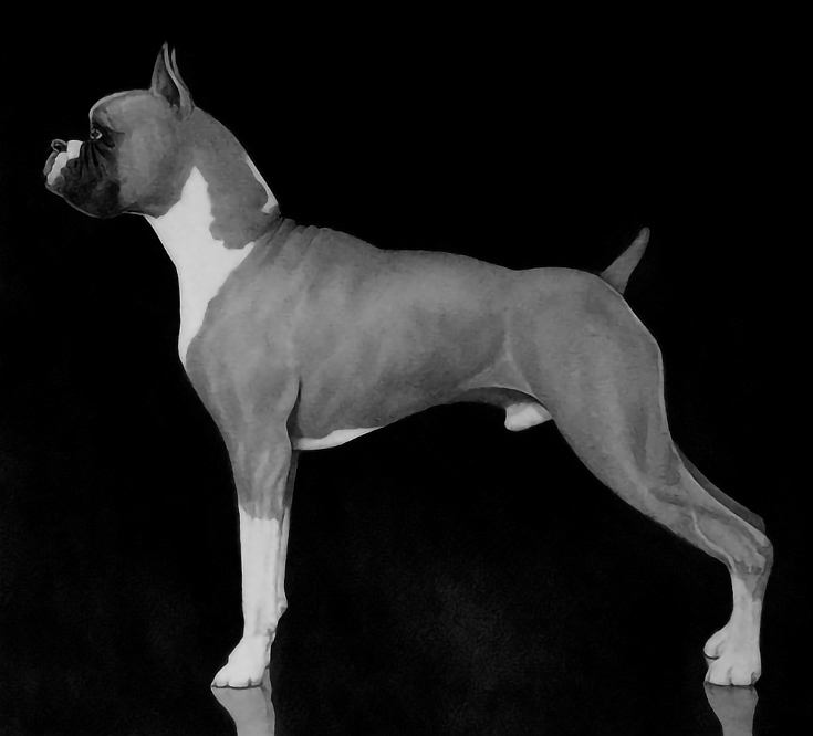
Boxer in a Box, graphite on print-making paper.
7. Continue the rest of the drawing until you are satisfied with the range of lights and darks throughout the entire piece. For this step, you may want to create a value strip using the same paper as the drawing. I use value strips to compare all of my light, mid-tone and dark values from different areas of the image until I think I’m finished.
At this point I put the drawing away for a week or so and work on something else. I need to refresh my eyes for that drawing. When I decide to look at the drawing again, I set it across the room towards dusk. If the drawing holds the room, my work is done.
I hope this post has been helpful—good luck!
For more drawings and tips from H. Edward Brooks, please visit his drawing blog.
This post may contain affiliate links.