When it comes to creating a good painting, successful artists stress the importance of studied preparation. Usually this involves sketching out ideas for composition, major shapes, value placement, colours, and proportions. A well-planned painting may be the product of a dozen or more thumbnail sketches, in varying stages of complexity.
I much prefer a brush to a pencil, however, so thumbnail sketches are agonizing for me to create. It’s just too much like homework!
Something I do enjoy is playing with photographs using my photo editing program, Corel PhotoPaint. I’ve found that if I start from a digital reference photo, I can do my pre-painting planning using photo editing software, and eliminate those tedious thumbnail sketches once and for all.
If you’d like to do the same, here’s how I use the computer to plan my paintings:
Start with a reference photo
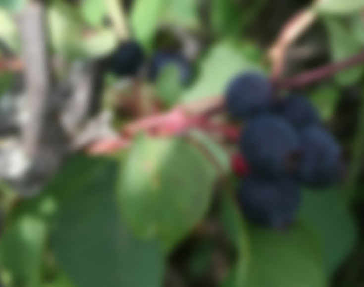
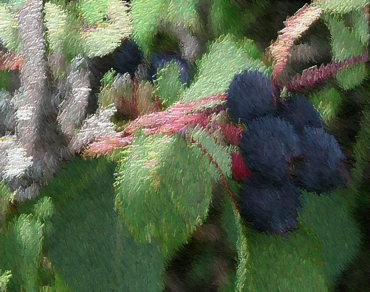
I always begin with a basic reference photo—this time it’s a picture of a cluster of Saskatoon berries that grow wild along the roadside here in Western Canada:
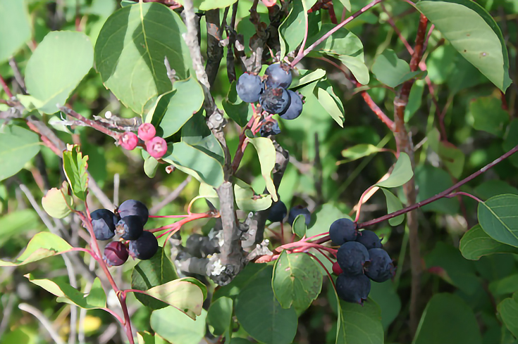
The photo by itself isn’t very promising. There’s some good contrast between lights and darks, which I like, but overall it’s too busy and lacks direction. I do like the cluster of berries on the lower right, however so using my crop tool I crop the photo to a pleasing arrangement focusing on that cluster.
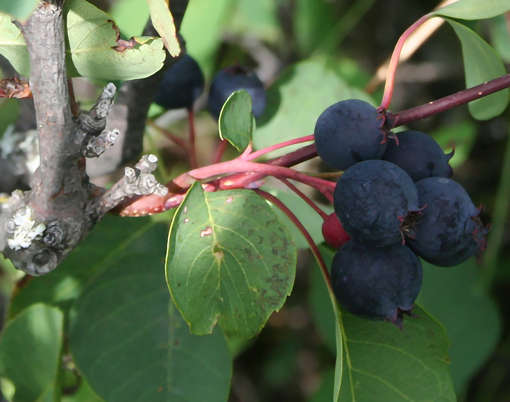
This looks much more paint-worthy, and now I can get to work editing the photo to help me break down the composition.
Create value studies using desaturate and contrast
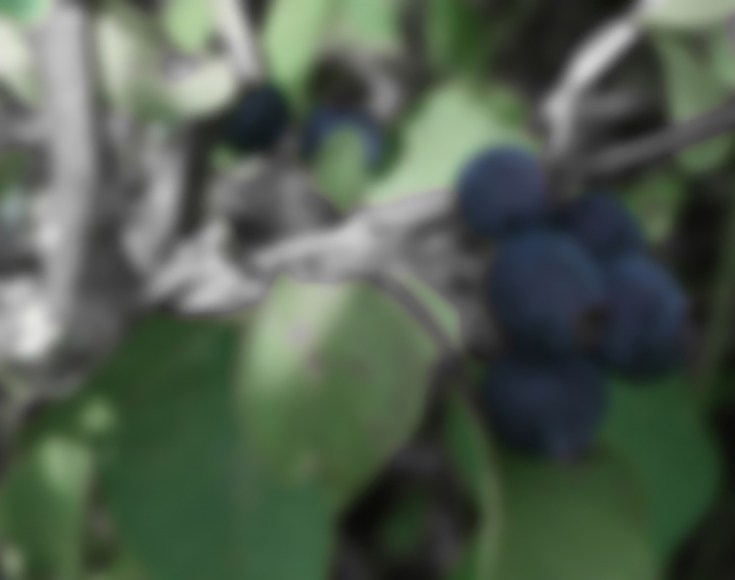
I struggle with value when I paint, so the first thing I do is study the values in the photograph. To do this, I desaturate the photo which simply removes all colours and makes everything shades of gray.
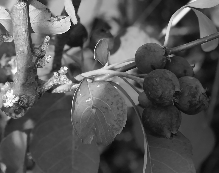
Once desaturated, the photo looks weak. Too much of it is a mid-tone, and it’s especially hard to discern the diference between the darks and mid-darks.
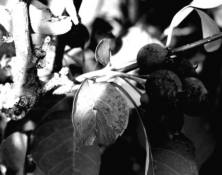
I’m going to take some creative license and exaggerate the values in the photo so I can see those differences a little better. I used my contrast enhancement tool and adjusted the sliders until I get a dramatic variation between light and dark.
This is a thumbnail to help me see value, not detail, so I’m not worried about image details that are lost in the transition.
I’m happy with the value study at this point. I can clearly see where my lights and darks fall, and now it’s obvious that the photo is divided mainly into light and dark values by the diagonal branch running through the middle.
Notice how there are also some nice value transitions in the edges of the leaves that weren’t in the original photo—I’ll want to include that in my painting as well.
Study the colors with gaussian blur and saturation
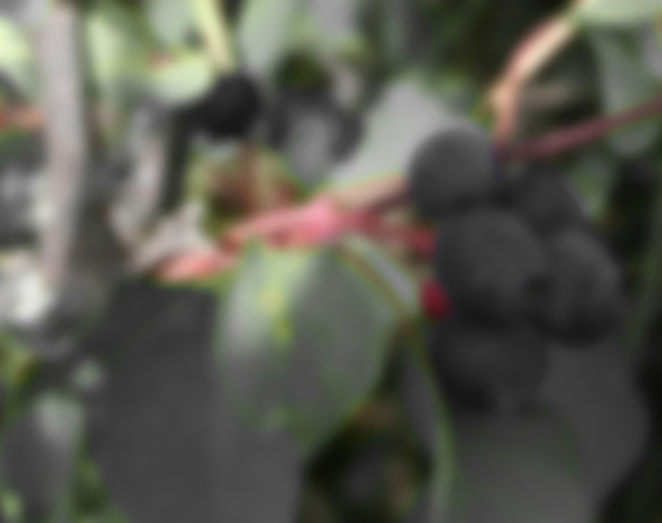
Having completed my value study, it’s time to look at the colors in the photograph more closely. My left-brain tendency is to see a leaf and think “green” when instead I need to divorce my expectations and see what is truly there.
To do this, I’m going to blur my original reference photo using the gaussian blur tool. With the colors separated from the details, it’s a little easier to distinguish between what’s there and what’s not.
I also like to get an idea of cool and warm areas in my photograph. Using the Hue/Saturation/Lightness tool I can desaturate all the warm tones in my photo. The colors that are left show the cool areas in my painting.
Then, going back to my original blurred version, I desaturate the cool tones this time, which gives me a photo that is primarily grayscale except for the areas of the photo that contain red, magenta or yellow—my warm tones.
Use special effects to see things differently
I also use the special filters on Corel PhotoPaint to help me see the interconnectedness of value, hue and shape. Here I’ve used the cubist artistic effect. Interesting change, isn’t it?
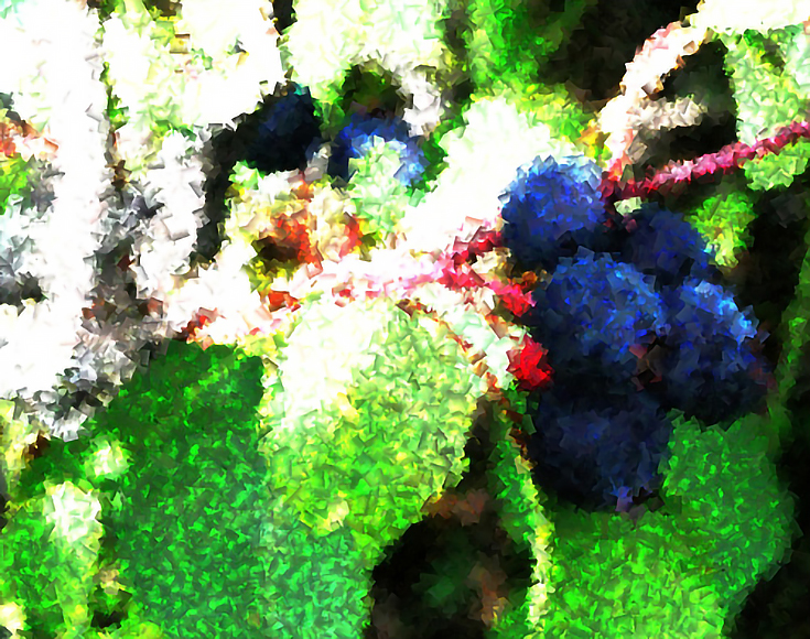
This next effect is called palette knife—and even if you don’t have these exact filters on your own photo editing program, you’ll probably find something similar.
Do either of these look like a real painting? Not to me, but they do serve to reinforce in my mind the way the photo is composed and how the light falls. They also give me suggestions on how to style my painting.
When I’m ready to paint, I print all of my computerized “thumbnails” to use as a reference during the painting process. I like to print them in true thumbnail size 2-3 inches wide, as a sheet of index prints, but you can print them in any size you want.
Not only does photo editing software give us powerful tools for breaking apart the visual elements of a reference photo, but it’s also quite efficient, time-wise. Editing all of the photos above only took a matter of minutes which let me get down to the business of painting much, much faster.
If you’d like to see Angela Fehr’s completed painting of these Saskatoon berries, either follow the previous link or visit her blog, Painting Simplicity.
This post may contain affiliate links.