Recently I took an online class, “Still Life the Colourful Way,” with Charlotte Herczfeld, a Swedish pastelist with an amazing mastery of color.
Charlotte studied with Susan Sarbach, who you may know as the author of Capturing Radiant Light & Color in Oils and Pastels. Susan also studied with Henry Hensche, who developed the Colorist approach to painting.
Colorist artists produce incredibly vibrant, color-drenched paintings. These are the types of paintings that have always fascinated me—they look true to color, but are brighter than real life, imparting a magical feeling that the world is a richer, more beautiful place than we can see in our day-to-day lives.
My years as a colored pencil artist taught me to see all the colors that were there: the shadow colors, reflected colors, and highlight colors, so I wasn’t a complete duffer when I started the course. All the same, I wasn’t prepared for yet another quantum leap in perception.
Charlotte taught me to see the colors that aren’t there. To find, and then heighten, each subtle hue to give as much oomph to the painting as I realistically could.
After her course, I can’t help but look at objects like my muted tan and gray bedspread and see it as a Colorist would, in blues, oranges, golds and lemon yellows.
If you haven’t tried a painting using the Colorist method yet, keep reading for a brief explanation of the stages involved. Rather than paraphrase Charlotte’s excellent instructions, I’ll use my own words and illustrating it with one of my pastel paintings.
Stage 1. “Faux Fauvism”
This stage is garish, so luckily it doesn’t stop here. Start off by using warm colors (red, yellow, orange) for everything in the light and a cool colors (violet, blue, green) for everything in shadow, whether that color matches what you’re painting or not.
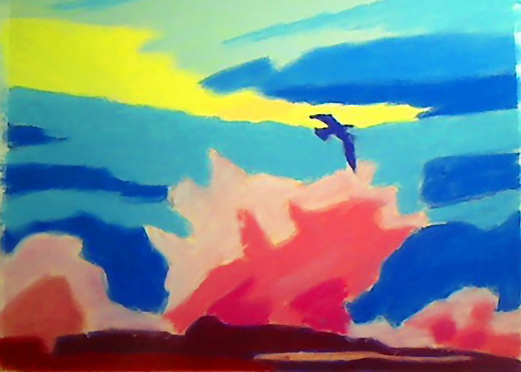
Make sure that no area is exactly like the color of any other area. This will make your painting more lively, and you can can also use it to lead the eye right into your focal point where the strongest contrasts and brightest colors are.
You may find that you paint much faster than normal using the Colorist method, because it begins rough and gets more detailed in gradual stages. You won’t spend any time on details until the very end.
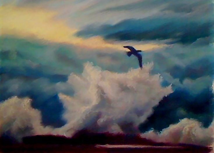
Stage 2. “Knocking back the color”
This stage is still a flat cartoon of a painting. Without adding any more detail, push all your color fields back to their accurate colors. Depending on your subject, this may be a dramatic change, as mine was in Sea Crash.

My storm scene is very muted, so it took more work to get a good Stage 2. The overall feeling of this seascape still had to be a natural warm blue-gray, with pale yellow sunlight barely breaching the clouds.
In Stage 2, mixing mud is OK if that’s what your subject calls for. You’ll get pure, intense colors by mixing colors that exist side-by-side on the color wheel (lemon yellow and orange, for example). Mix orange with a green or blue, and you’ll get mud.
In the right context, though, those muddy colors are wonderful—an overcast day, a rumpled beige and gray towel, a fluffy brown kitten, or just skin tones in general.
It used to mildly puzzle me that the smallest starter sets of pastels or colored pencils included all the bright colors of the spectrum, but left out the wide range of browns and grays necessary for realism. Of course now I know you can get the mud if you start out with the brights.
When I was knocking down color for Sea Crash, I threw in a lot of complementary colors and didn’t try to retain any brilliance in my pursuit of the correct “mud” color. With pastels, you gain a richness from this that you wouldn’t if you used a set of neutral grays or browns, because in person, the tiny particles of pastel dust in your painting will retain the vibrance of their original pigments.
Look closely enough and any Colourist pastel turns into a micro-Seurat. All the complementary flecks from the different pigments reflect against each other and then combine for optical mixing.
Oil painters can do something similar by painting brush strokes of pure complementary colors right next to each other on the canvas.
Stage 3. “Establishing depth and value”
For a colorist, value is embedded in the colors they see. It’s never about adding black to “darken” a color, it’s about finding the right color that also happens to be a darker value. In addition, every plane change is a hue change, and you’ll find that this creates a lot of color variation.
Yellow, orange and red extend from the middle of the value range almost all the way to the top. Use those colors to lighten your image. Pure violet, blue and green start at middle values, and go down nearly to black.
As you create additional value, remember the old illustrator’s trick of keeping the darkest region of the light area lighter than the lightest region of the dark area.
When you’ve completed Stage 3, your painting will be much more three-dimensional and not quite so abstract. This is where you can start developing hard and soft edges by subtly blending colors when necessary.
Stage 4. “Adding in the details”
The last stage tends to go fast. At this point my own painting was nearly done, and I finished it of by touching up some highlights, making little adjustments here and there and adding detail to the spray and the clouds. If my subject wasn’t slippery water and misty clouds I would’ve firmed up more hard edges at this point, too.
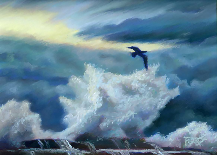
Because I was aiming for very realistic colors, you’ll notice that I also tinted the clouds and the surf to keep the intensity down in the final version of Sea Crash.
The amount that you “knock back” your Stage 1 colors (and the variety of hues you add in Stage 3) will determine the realism of your own paintings.
Using the Colorist method has opened my eyes to an entirely new world of color. Whether you’re a pastelist, an oil painter, or you work in another medium entirely, I hope this article will inspire you to try the Colorist method too.
This post may contain affiliate links.