Nobody wants to be boring—not in life, and not in their art. The good news is that we can avoid boring passages in our paintings simply by remembering to add variation in four specific ways while we paint.
1. Vary the direction of your brush strokes
Creating a lot of similar brush strokes in the same direction can be a recipe for boring art. Keep your brush strokes interesting by consciously developing a habit of following each stroke you make with one that moves in a different direction. This little correction alone will go a long way toward deleting the threat of boredom.
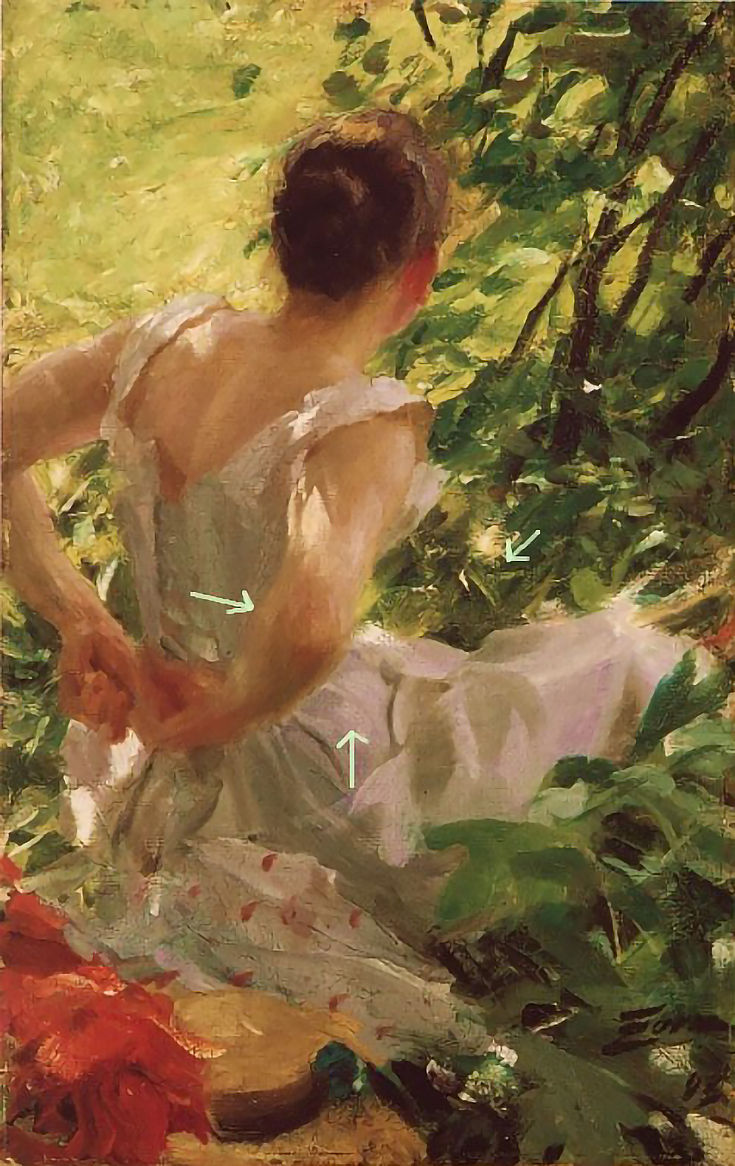
In Anders Zorn’s painting below, Woman Dressing, we can clearly see this type of variation at work. I’ve pointed out three areas, but there are many more as well.
2. Incorporate variation into long edges
Long, uninterrupted edges can also be dangerously boring. It’s easy to paint things like roadsides, lake edges, tree trunks, etc., too quickly and simply fail to see the little interruptions and variations that they actually have.
Noticing and rendering these subtle variations will prevent your shapes from appearing stiff or isolated from the rest of the painting, and will keep the flow of the painting much more engaging for the viewer.
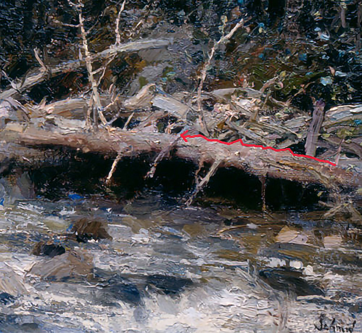
One great example of this is how Richard Schmid has added little wobbles and details along the top and bottom edge of this fallen tree trunk.
3. Add a variety of colors within one color
Solid colored subjects like a clear sky, bell peppers, grapefruit or a golf range can appear flat and boring if we fail to notice their internal color variation.
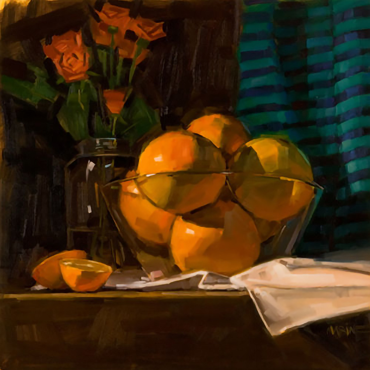
Adding differences in value, temperature and intensity will ensure that even these “solid” colored objects remain interesting to your viewers. Carol Marine is an expert at this—notice all of the colors that she’s used to describe the oranges below.
4. Vary darks within darks and lights within lights
An entire area covered in dark shadows (or illuminated by a bright light) sometimes seems to be to be the same value throughout.
However, by squinting or examining the area closely, it’s often possible to find value and hue variations that we didn’t see at first. . . and recreating those variations in our paintings will always add interest for our viewers.
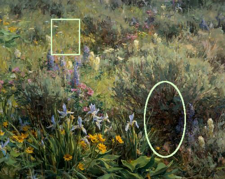
Clyde Aspevig does this quite well in his painting entitled Land Snorkeling. Notice that even after lightening some areas in the shadow, those “lighter” values are still darker than anything in the lit regions. Too much contrast would ruin the effect.
Bonus method: create variations on an entire theme
Just as musicians will create variations on a theme by using key changes, tempo adjustments, or new harmonies; so, too, can artists.
For instance, we can take a single image, color, shape or idea and change it just slightly; in point of view, color, value, texture, size, etc. The possibilities are limitless.
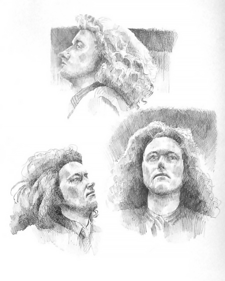
Below, Katherine Tyrrell has illustrated three variations of a single image in her pen and ink drawing, Three Perspectives of Ben.
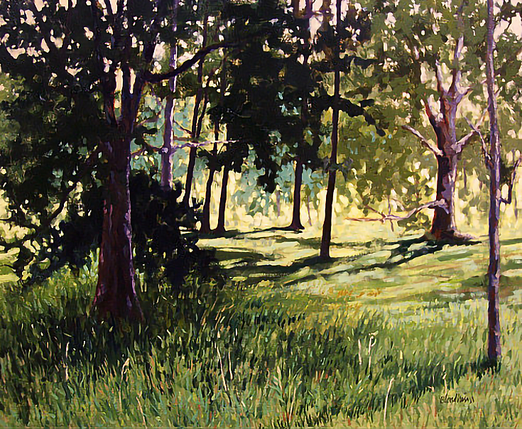
In My Yard I, Linda Blondheim explores multiple values, temperatures and hue variations found in the color green.
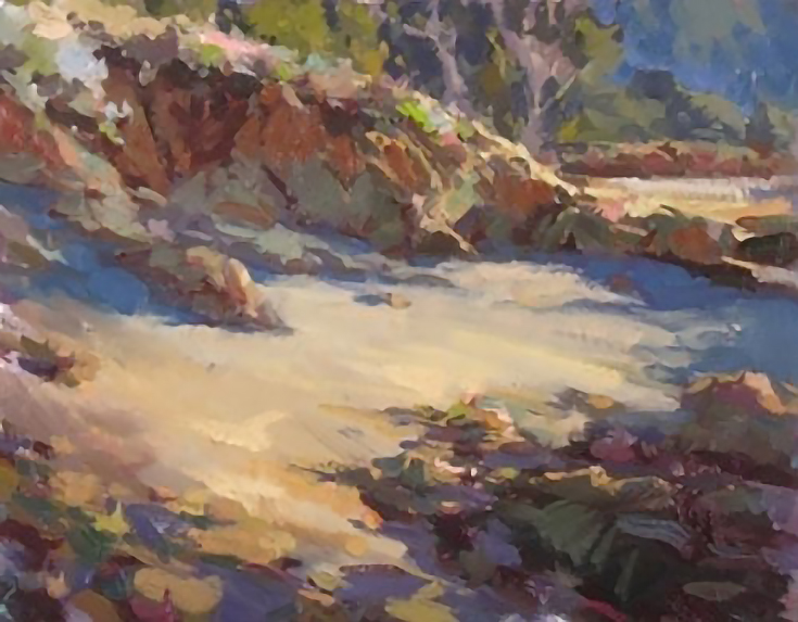
And John Burton brings all sorts of color variations to a hillside of rocks in this last painting entitled, A New Direction.
Variation occurs naturally in our surroundings and in our lives. When it’s missing in art, we feel it—although sometimes we don’t understand exactly what “it” is or why we’re not satisfied with the final product.
Take a look at your own art and see if you can spot any areas where more variation is needed. If you do, try using of the methods above to add a little more variety (and an extra spark of interest) to your work.
This post may contain affiliate links.