I had such a fantastic time at Desmond O’Hagan’s three day workshop in June of 2007, that I thought I’d write down a short review of the event:
First off, Desmond paints in both soft pastels and oils, so his techniques work in either medium. However, most of the participants in this workshop were pastel artists, and it was put on by the Northwest Pastel Society.
The main concept was to focus on overall shapes and areas of light and dark, then simply imply the details. Desmond was an excellent instructor throughout, and if you feel like you need to loosen up in your approach to art, I’d definitely recommend participating in one his workshops.
Once you tackle the concept of painting shapes rather details, you’ll be amazed at how much more impressionistic your paintings look.
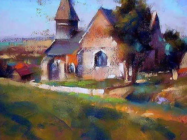
Here’s one of the demo paintings he did for us (in under an hour, no less!)
If you use photos when you paint, you’re in good company—Desmond used a lot of references during the workshop but repeatedly emphasized that you shouldn’t include everything that’s in a photo. For example, busy markets or street scenes can get rather full, so you must be selective and intentional to get a good composition.
Like many artists, Desmond also suggested planning out the look of your painting before you begin the real thing. He started out each piece by making small thumbnail sketches and value studies of his subject matter.
Although this practice does add extra time to the process, it forces you to get the hard choices out of the way before you’re committed to a final surface.
Once his thumbnails were finished, Desmond defined his paintings with a light vine charcoal drawing, making sure all of his proportions were correct. He then painted in all the darks, using black (yes black), dark brown, dark blue and/or dark green pastels before moving to the middle values, and finally the highlights.
Desmond worked from dark to light and cool to warm. It takes discipline to paint this way, saving the lightest, warmest colors until the end, but it’s a good rule to follow if you want to get the best contrast overall.
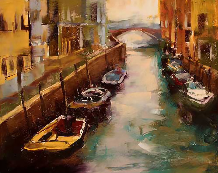
(Above you can see my first painting from the workshop using the dark to light method)
This next statement is probably even more important, however—99% of your strokes should be with the sides of the pastel sticks. Desmond mentioned that he hardly ever uses the point of the pastel, and he’d even broken most of his pastel sticks in half to achieve shorter widths.
This approach lets you think in terms of “shape” instead of “outline” which leads to a more impressionist feel. Desmond’s paintings have very little true detail—all the detail is implied. This helps viewers discover something different each time they come back to his paintings.
And how do you imply detail? Desmond taught us to avoid predictable pastel strokes, and let edges blend into each other. Again, it’s not the outlines of objects that you want to paint, it’s the shapes.
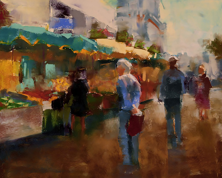
(That’s my second painting from the event—each one was about 9×12 inches).
Special thanks to artist Peggy Braeutigam for contributing to this article, and I do hope you’ve all taken something useful away from it.
To see additional oil and pastel artwork or read more articles by David Patterson, visit his website at PhotosAndFineArt.com.
This post may contain affiliate links.